

Week 4: Visualisation
[jupyter][google colab][reveal]
Abstract:
This lecture introduces different approaches to discovering latent structure in data. We begin by examining clustering as a discrete approach to finding latent structure, then explore why high dimensional data often has simpler underlying continuous representations. This motivates our introduction to Principal Component Analysis (PCA) as a fundamental approach to continuous latent variable modeling.
ML Foundations Course Notebook Setup
We install some bespoke codes for creating and saving plots as well as loading data sets.
%%capture
%pip install notutils
%pip install pods
%pip install mlai
import notutils
import pods
import mlai
import mlai.plot as plotVisualization and Human Perception
The human visual system is remarkable - it represents our highest bandwidth connection to the world around us, with the optic tract carrying around 8.75 million bits per second of information to our brain (Koch et al., 2006). The “nerve” is misnamed, it is actually an extension of brain tissue, highlighting how central vision is to our cognitive architecture. Our (bidrectional) verbal communication is limited to around 2,000 bits per minute, but our eyes actively grab at information from our environment at vastly higher rates. This “active sensing” approach, see e.g. MacKay (1991) and O’Regan (2011), means we don’t passively receive visual information but actively construct our understanding through rapid eye movements called saccades that sample our environment hundreds of times per second.
Behind the Eye
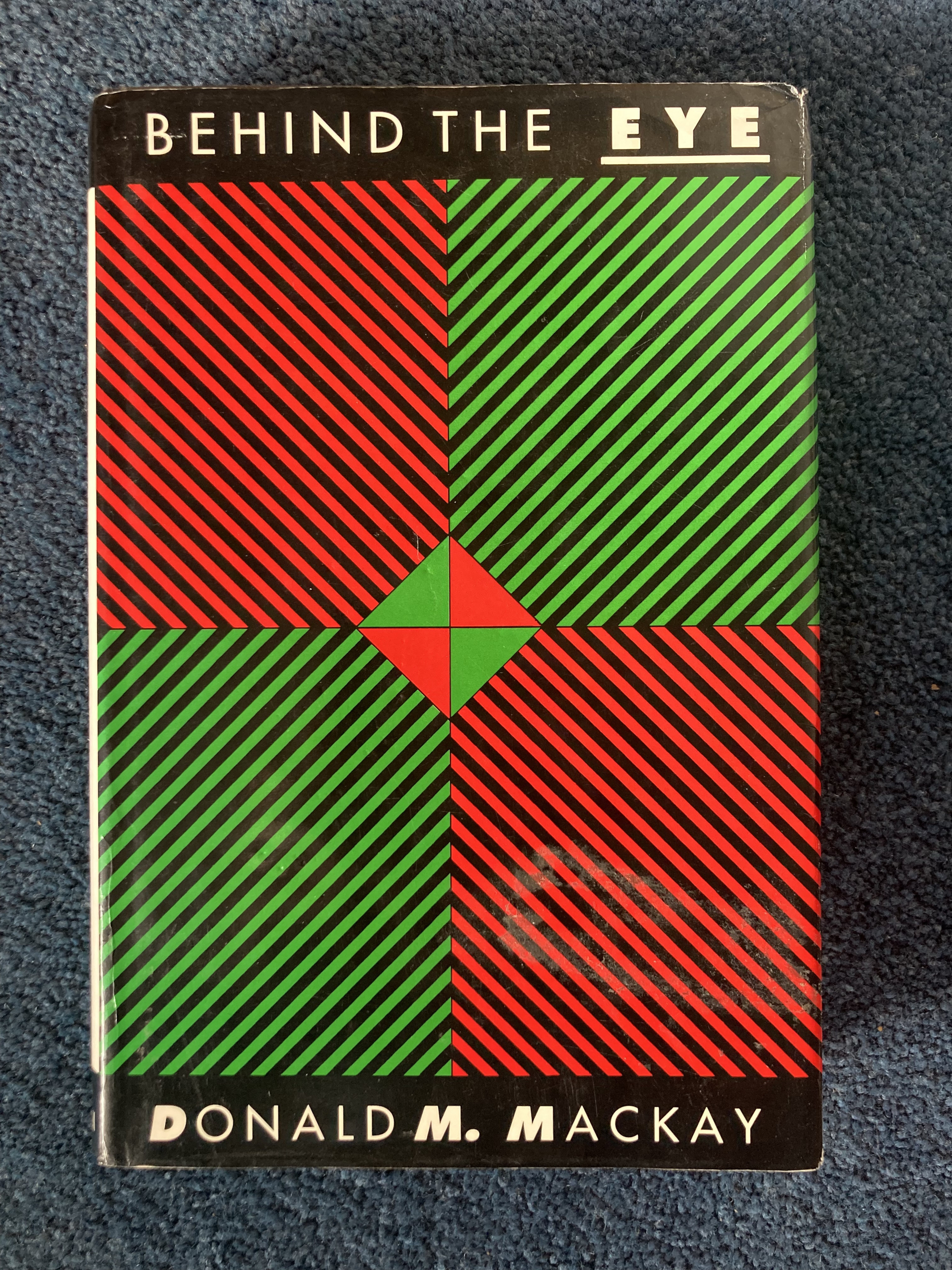

Figure: Behind the Eye (MacKay, 1991) summarises MacKay’s Gifford Lectures, where MacKay uses the operation of the eye as a window on the operation of the brain.
The high-bandwidth visual channel makes visualization a powerful tool for communication and understanding. But it also makes us vulnerable to manipulation through misleading. Just as social media algorithms can manipulate our behavior through careful curation of information, indeed they sometimes manipulate us through our visual system, poorly designed or deliberately deceptive visualizations can lead us to incorrect conclusions by hijacking our natural visual processing capabilities.

Figure: Kevin O’Regan’s book, “Why Red Doesn’t Sound Like a Bell” is about the sensiorimotor perspective on feel and ranges from our senses to our consciousness.
The book, “Why Red Doesn’t Sound Like a Bell” by J. Kevin O’Regan (O’Regan, 2011) suggests a sensorimotor approach to understanding our consciousness. One that depends on how our senses interact with the world around us. The implication is that our consciousness is as much a function of our environment as of our mind. This is particularly interesting for social interaction, where our external environment is populated by other intelligent entities. If we accept this interpretation it would imply that we should pay a lot of attention to modes of human to human interaction when developing environments in which we can feel comfortable and able to perform.
In this lecture we’ll introduce the basics of visualisation through the lens of dimensionality reduction - techniques that help us represent high-dimensional data.
See Lawrence (2024) bandwidth, communication p. 10-12,16,21,29,31,34,38,41,44,65-67,76,81,90-91,104,115,149,196,214,216,235,237-238,302,334. See Lawrence (2024) MacKay, Donald p. 227-228,230-237,267-270. See Lawrence (2024) optic nerve/tract p. 205,235. See Lawrence (2024) O’Regan, Kevin p. 236-240,250,259,262-263,297,299. See Lawrence (2024) saccade p. 236,238,259-260,297,301. See Lawrence (2024) visual system/visual cortex p. 204-206,209,235-239,249-250,255,259,260,268-270,281,294,297,301,324,330.
Reconstruction of the Data
Given any posterior projection of a data point, we can replot the original data as a function of the input space.
We will now try to reconstruct the motion capture figure form some different places in the latent plot.
Exercise 1
Project the motion capture data onto its principal components, and then use the mean posterior estimate to reconstruct the data from the latent variables at the data points. Use two latent dimensions. What is the sum of squares error for the reconstruction?
Other Data Sets to Explore
Below there are a few other data sets from pods you might want to explore with PCA. Both of them have \(p\)>\(n\) so you need to consider how to do the larger eigenvalue probleme efficiently without large demands on computer memory.
The data is actually quite high dimensional, and solving the eigenvalue problem in the high dimensional space can take some time. At this point we turn to a neat trick, you don’t have to solve the full eigenvalue problem in the \(p\times p\) covariance, you can choose instead to solve the related eigenvalue problem in the \(n\times n\) space, and in this case \(n=200\) which is much smaller than \(p\).
The original eigenvalue problem has the form \[ \mathbf{Y}^\top\mathbf{Y}\mathbf{U} = \mathbf{U}\boldsymbol{\Lambda} \] But if we premultiply by \(\mathbf{Y}\) then we can solve, \[ \mathbf{Y}\mathbf{Y}^\top\mathbf{Y}\mathbf{U} = \mathbf{Y}\mathbf{U}\boldsymbol{\Lambda} \] but it turns out that we can write \[ \mathbf{U}^\prime = \mathbf{Y}\mathbf{U} \Lambda^{\frac{1}{2}} \] where \(\mathbf{U}^\prime\) is an orthorormal matrix because \[ \left.\mathbf{U}^\prime\right.^\top\mathbf{U}^\prime = \Lambda^{-\frac{1}{2}}\mathbf{U}\mathbf{Y}^\top\mathbf{Y}\mathbf{U} \Lambda^{-\frac{1}{2}} \] and since \(\mathbf{U}\) diagonalises \(\mathbf{Y}^\top\mathbf{Y}\), \[ \mathbf{U}\mathbf{Y}^\top\mathbf{Y}\mathbf{U} = \Lambda \] then \[ \left.\mathbf{U}^\prime\right.^\top\mathbf{U}^\prime = \mathbf{I} \]
Olivetti Faces
You too can create your own eigenfaces. In this example we load in the ‘Olivetti Face’ data set, a small data set of 200 faces from the Olivetti Research Laboratory. Below we load in the data and display an image of the second face in the data set (i.e., indexed by 1).
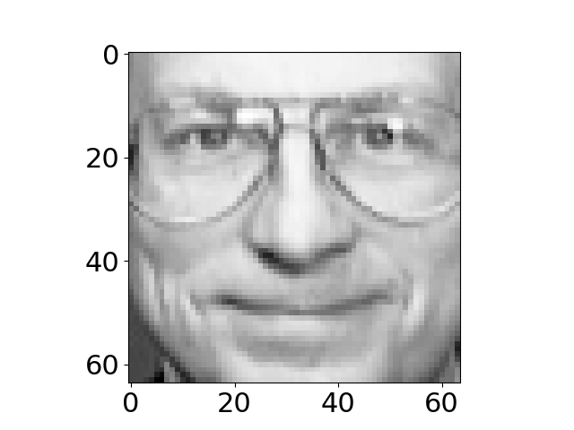
Figure: Data set from Olivetti Research Laboratory of faces.
Note that to display the face we had to reshape the appropriate row of the data matrix. This is because the images are turned into vectors by stacking columns of the image on top of each other to form a vector. The operation
im = np.reshape(Y[1, :].flatten(), (64, 64)).T}
recovers the original image into a matrix im by using the np.reshape function to return the vector to a matrix.
Visualizing the Eigenvectors
Each retained eigenvector is stored in the \(j\)th column of \(\mathbf{U}\). Each of these eigenvectors is associated with particular directions of variation in the original data. Principal component analysis implies that we can reconstruct any face by using a weighted sum of these eigenvectors where the weights for each face are given by the relevant vector of the latent variables, \(\mathbf{ z}_{i, :}\) and the diagonal elements of the matrix \(\mathbf{L}\). We can visualize the eigenvectors \(\mathbf{U}\) as images by performing the same reshape operation we used to recover the image associated with a data point above. Below we do this for the first nine eigenvectors of the Olivetti Faces data.
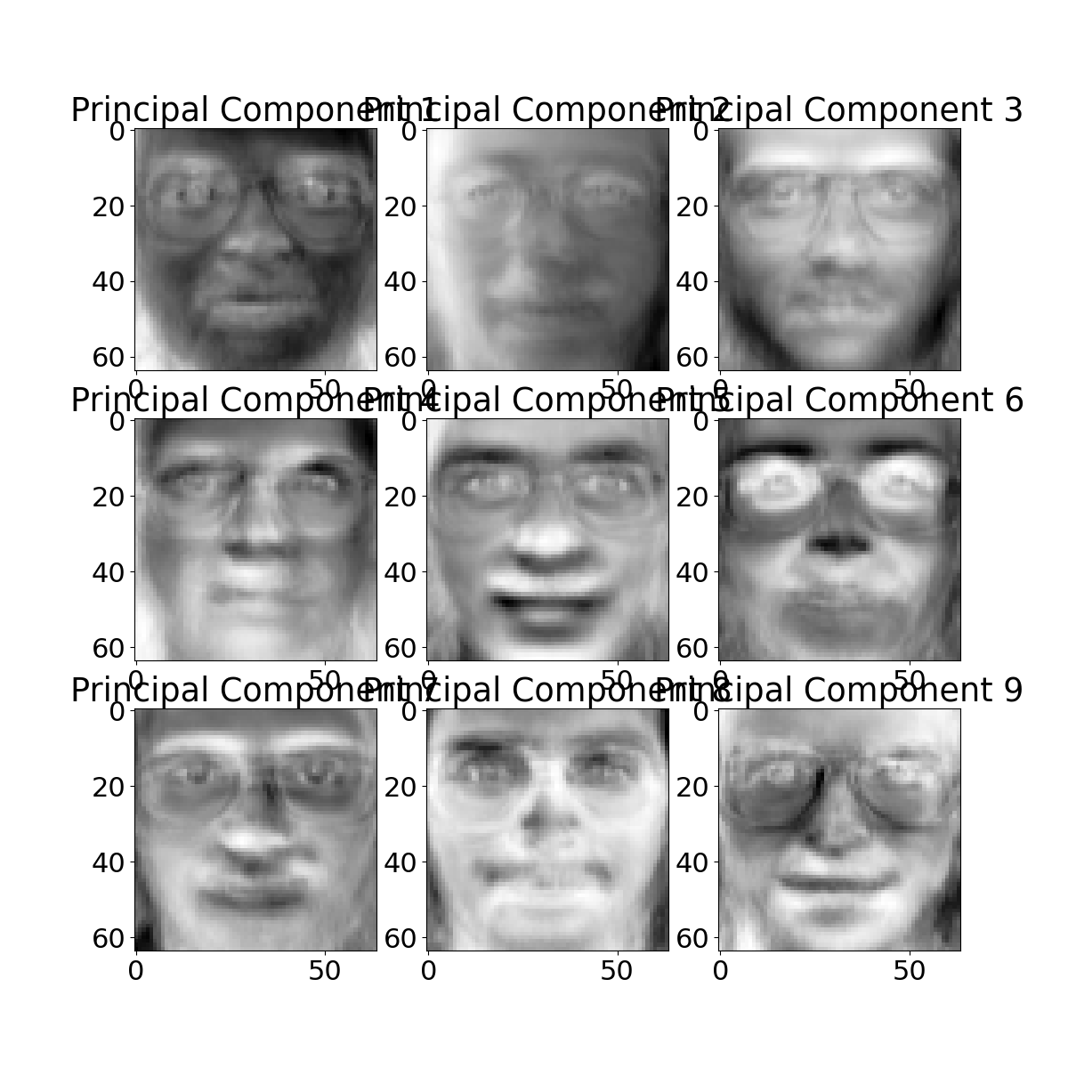
Figure: First 9 eigenvectors of the Olivetti faces data.
Reconstruction
We can now attempt to reconstruct a given training point from these eigenvectors. As we mentioned above, the reconstruction is dependent on the value of the latent variable and the weights from the matrix \(\mathbf{L}\). First let’s compute the value of the latent variables for the point we want to construct. Then we’ll use them to compute the weightings of each of the eigenvectors.
mu_x, C_x = posterior(Y, U, ell, sigma2)
reconstruction_weights = mu_x[display_index, :]*ell
print(reconstruction_weights)
This vector of reconstruction weights is applied to the ‘template images’ given by the eigenvectors to give us our reconstruction. Below we weight these templates and combine to form the reconstructed image, and show the comparison to the original image.
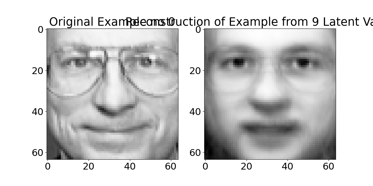
Figure: Reconstruction from the latent space of the faces data.
The quality of the reconstruction is a bit blurry, it can be improved by increasing the number of template images used (i.e. increasing the latent dimensionality).
Gene Expression
Each of the cells in your body stores your entire genetic code in your DNA, but at any one moment it is only ‘expressing’ a small portion of that code. Your cells are mainly constructed of protein, and these proteins are manufactured by first transcribing the DNA to RNA and then translating the RNA to protein. If the DNA is the cells hard drive, then one role of the RNA is to act like a cache of data that is being read from the hard drive at any one time. Gene expression arrays allow us to measure the quantity of different types of RNA in the cell, effectively analyzing what’s in the cache (although we have to destroy the cell or the tissue to access it). A gene expression experiment often consists of a time course or a series of experiments that characterise the gene expression of cells at any given time.
We will now load in one of the earliest gene expression data sets from a 1998 paper by Spellman et al., it consists of gene expression measurements of over six thousand genes in a range of conditions for brewer’s yeast. The experiment was designed for understanding the cell cycle of the genes. The expectation is that there should be oscillating signals inside the cell.
First we extract the principal components of the gene expression.
import pods# load in data and replace missing values with zero
data=pods.datasets.spellman_yeast_cdc15()
Y = data['Y'].fillna(0)
q = 5
U, ell, sigma2 = ppca(Y, q)
mu_x, C_x = posterior(Y, U, ell, sigma2)Now, looking through, we find that there is indeed a latent variable that appears to oscilate at approximately the right frequency. The 4th latent dimension (index=3) can be plotted across the time course as follows.
To reveal an oscillating shape. We can see which genes correspond to this shape by examining the associated column of \(\mathbf{U}\). Let’s augment our data matrix with this score.
gene_list = Y.T
gene_list['oscilation'] = np.sqrt(U[:, 3]**2)
gene_list.sort(columns='oscilation', ascending=False).index[:4]
We can look up the first three genes in this list which now ranks the genes according to how strongly they respond to the fourth latent dimension. The NCBI gene database allows us to search for the function of these genes. Looking at the function of the four genes that respond most strongly to the third latent variable they are all genes that encode histone proteins. The histone is thesupport scaffold for the DNA that ensures it folds correctly within the cell creating the nucleosomes. It seems to make sense that production of histone proteins should be strongly correlated with the cell cycle, as when the cell divides it needs to create a large number of histone proteins for creating the duplicated nucleosomes. The relevant links giving the descriptions of each gene given here: YDR224C, YDR225W, YBL003C and YNL030W.
Multi-Dimensional Scaling
Multi-Dimensional Scaling (MDS) is a classical approach to dimensionality reduction that works directly with similarities or proximities between entities. The goal is to find a geometric configuration that preserves these relationships.
The MDS Objective
Given \(n\) entities and a matrix of proximity relationships between them \(\mathbf{ \MakeUppercase{d}}\) where \(\mathbf{ \MakeUppercase{d}}_{ij}\) is the relationship between entity \(i\) and \(j\), our task is to find an embedding \(\mathbf{Y}= [\mathbf{ y}_1, \ldots, \mathbf{ y}_n]\) such that \(\|\mathbf{ y}_i - \mathbf{ y}_j\|_{L2} \approx \delta_{ij}\).
In MDS this is formulated as minimizing the Frobenius norm between the given proximity matrix \(\mathbf{ \MakeUppercase{d}}\) and the one calculated directly from the embedding \(\boldsymbol{ \Delta}\) where \(\boldsymbol{ \Delta}_{ij} = \|\mathbf{ y}_i - \mathbf{ y}_j\|_{L2}\):
\[\hat{\mathbf{Y}} = \argmin_{\mathbf{Y}} \|\boldsymbol{ \Delta}- \mathbf{ \MakeUppercase{d}}\|_F\]
Properties of the Frobenius Norm
The Frobenius norm is the generalization of the Euclidean norm to matrices. The general element-wise norm for matrices \(L_{p,q}\) takes the form:
\[\|\mathbf{W}\|_{p,q} = \left(\sum_{j=1}^n \left(\sum_{i=1}^m |m_{ij}|^p\right)^{\frac{q}{p}}\right)^{\frac{1}{q}}\]
where the Frobenius norm is the case where \(p = q = 2\). For a square diagonal matrix, the Frobenius norm is just the square root of the sum of the squares of the diagonal elements:
\[\|\mathbf{W}\|_F = \sqrt{\text{trace}(\mathbf{W}^\top\mathbf{W})} = \sqrt{\text{trace}(\mathbf{W}^2)}\]
MDS Solution
Using the properties of similar matrices that we established earlier, if \(\mathbf{A}\sim \mathbf{B}\) then \(\mathbf{A}^2 \sim \mathbf{B}^2\) and the trace is invariant under similarity. This means that if we diagonalize a matrix through its eigendecomposition, the Frobenius norm is simply the square root of the sum of the eigenvalues.
Using this, we can rewrite the MDS optimization problem:
\[\argmin_{\boldsymbol{ \Delta}} \|\boldsymbol{ \Delta}- \mathbf{ \MakeUppercase{d}}\|_F^2 = \argmin_{\boldsymbol{ \Delta}} \text{trace}(\boldsymbol{ \Delta}- \mathbf{ \MakeUppercase{d}})^2\]
Now we will write \(\mathbf{ \MakeUppercase{d}}\) using its eigendecomposition and also rewrite \(\boldsymbol{ \Delta}\) using a similar matrix:
\[\argmin_{\mathbf{W}, \hat{\boldsymbol{ \Lambda}}} \text{trace}(\mathbf{W}\hat{\boldsymbol{ \Lambda}}\mathbf{W}^\top - \mathbf{U}\boldsymbol{ \Lambda}\mathbf{U}^\top)^2\]
Using the fact that the trace is invariant under similarity transform, we can pre and post multiply with the known eigenvectors of the proximity matrix:
\[\argmin_{\mathbf{W}, \hat{\boldsymbol{ \Lambda}}} \text{trace}(\mathbf{U}^\top(\mathbf{W}\hat{\boldsymbol{ \Lambda}}\mathbf{W}^\top - \mathbf{U}\boldsymbol{ \Lambda}\mathbf{U}^\top)\mathbf{U})^2\] \[= \argmin_{\mathbf{W}, \hat{\boldsymbol{ \Lambda}}} \text{trace}(\mathbf{U}^\top\mathbf{W}\hat{\boldsymbol{ \Lambda}}\mathbf{W}^\top\mathbf{U}- \boldsymbol{ \Lambda})^2\]
From the above we can see that we have a diagonal matrix \(\boldsymbol{ \Lambda}\) that we want to match by choosing \(\mathbf{W}\) and \(\hat{\boldsymbol{ \Lambda}}\). This means that as \(\hat{\boldsymbol{ \Lambda}}\) is diagonal, the minima will be achieved when \(\mathbf{U}^\top\mathbf{W}= \mathbf{I}\). This leads to:
\[\argmin_{\mathbf{W}, \hat{\boldsymbol{ \Lambda}}} \text{trace}(\mathbf{U}^\top\mathbf{W}\hat{\boldsymbol{ \Lambda}}\mathbf{W}^\top\mathbf{U}- \boldsymbol{ \Lambda})^2 = \argmin_{\hat{\boldsymbol{ \Lambda}}} \text{trace}(\hat{\boldsymbol{ \Lambda}} - \boldsymbol{ \Lambda})^2\] \[= \sum_{i=1}^N (\hat{\lambda}_i - \lambda_i)^2\]
Rank-Constrained Solution
To provide a rank \(q\) approximation \(\boldsymbol{ \Delta}\) to \(\mathbf{ \MakeUppercase{d}}\) we should therefore match the largest \(q\) eigenvalues and choose \[ \boldsymbol{ \Delta}= \sum_{j=1}^q\lambda_i u_j u_i^\top \] where the eigenvalues have been sorted such that \(\lambda_i \geq \lambda_j\) when \(i < j\). This leads to the following error of the embedding: \[ \|\boldsymbol{ \Delta}- \mathbf{ \MakeUppercase{d}}\|_F = \sqrt{\sum_{i=q+1}^n\lambda_i^2} \]
Equivalence between MDS and PCA
We can derive a simple equivalence between MDS and PCA in the linear setting. While MDS diagonalizes the \(n\times n\) Gram matrix \(\mathbf{Y}\mathbf{Y}^\top\), PCA diagonalizes the \(p\times p\) sample covariance matrix \(\frac{1}{n-1}\mathbf{Y}^\top\mathbf{Y}\). We’ll show the connection between these diagonalizations and how their eigenvectors relate.
Connecting the Eigendecompositions
Starting from the Gram matrix eigendecomposition \[ \mathbf{K}= \mathbf{Y}\mathbf{Y}^\top = \mathbf{U}\boldsymbol{ \Lambda}\mathbf{U}^\top\] \[(\mathbf{Y}\mathbf{Y}^\top)u_i = \lambda_iu_i \] Multiplying both sides by \(\frac{1}{n-1}\mathbf{Y}^\top\) on the left, \[ \frac{1}{n-1}\mathbf{Y}^\top(\mathbf{Y}\mathbf{Y}^\top)u_i = \lambda_i\frac{1}{n-1}\mathbf{Y}^\top u_i \] \[ \frac{1}{n-1}(\mathbf{Y}^\top\mathbf{Y})\mathbf{Y}^\top u_i = \lambda_i\frac{1}{n-1}\mathbf{Y}^\top u_i \] \[ \mathbf{C}(\mathbf{Y}^\top u_i) = \frac{\lambda_i}{n-1}(\mathbf{Y}^\top u_i) \]
Looking at this last equation, we can see this is exactly the behavior of an eigendecomposition of \(\mathbf{C}\) where: * The eigenvalue is \(\frac{\lambda_i}{n-1}\) * The corresponding eigenvector is \(\mathbf{Y}^\top u_i\)
Importantly, as the scaling of the MDS eigenvalue only depends on \(n\), the order of the eigenvalues remains the same.
Orthonormalization
One detail remains: the eigenvectors should form an orthonormal basis. While we know \(\mathbf{U}\) does so, we need to verify this for \(\mathbf{Y}^\top u_i\). For orthogonality \[ (\mathbf{Y}^\top u_i)^\top(\mathbf{Y}^\top u_i) = u_i^\top\mathbf{Y}\mathbf{Y}^\top u_i = \lambda_i \] To achieve normalization, we can scale the vectors: \[ \left(\frac{1}{\sqrt{\lambda_i}}\mathbf{Y}^\top u_i\right)^\top\left(\frac{1}{\sqrt{\lambda_i}}\mathbf{Y}^\top u_i\right) = 1 \]
Equivalence in Embeddings
We can now directly compare the embeddings from both methods. If we take the eigenvector corresponding to the largest eigenvalue \(u_1\)
MDS embedding: \[\mathbf{ z}_{\text{MDS}} = u_1\sqrt{\lambda_1}\]
PCA embedding (projecting the data onto the eigenvector): \[\mathbf{ z}_{\text{PCA}} = \mathbf{Y}\left(\frac{\mathbf{Y}^\top u_1}{\sqrt{\lambda_1}}\right) = \frac{\mathbf{Y}\mathbf{Y}^\top u_1}{\sqrt{\lambda_1}} = \frac{\lambda_1u_1}{\sqrt{\lambda_1}} = \sqrt{\lambda_1}u_1\]
Thus the embeddings of the two methods are identical.
Rank-Nullity Connection
This equivalence shouldn’t be surprising when we consider the rank-nullity theorem. For data \(\mathbf{Y}\in \Re^{n\times p}\), the sample covariance \(\mathbf{C}\in \Re^{p\times p}\) has maximum rank \(p\) while for MDS we work with the Gram matrix \(\mathbf{K}\in \Re^{n\times n}\).
However, the maximum rank of the Gram matrix is not \(n\) as it is generated from data that only has \(p\) degrees of freedom. Therefore its rank is the same as the covariance matrix \[ \text{Rank}(\mathbf{Y}^\top\mathbf{Y}) = \text{Rank}(\mathbf{Y}\mathbf{Y}^\top) \]
Implications
This equivalence is important because PCA was derived as a probabilistic model with clear interpretable assumptions. We can now translate these assumptions to MDS
- MDS is also implicitly assuming Gaussian-distributed data
- The Frobenius norm minimization in MDS corresponds to maximum likelihood estimation under this Gaussian assumption
- Both methods are finding the same linear subspace that maximizes variance
The key difference emerges when we consider non-linear extensions:
- From PCA we have a clear model that can be extended to non-linear functions through GPs (leading to GP-LVM)
- From MDS we typically create non-linear versions by modifying the distance calculations between points
The model-based approach of PCA makes its assumptions explicit and provides a clearer path to principled non-linear extensions.
Iterative Dimensionality Reduction
While spectral methods like PCA and classical MDS provide analytical solutions through eigendecomposition, many dimensionality reduction problems require iterative optimization approaches. These methods can often capture more complex relationships in the data but come at the cost of potentially getting stuck in local optima.
Stress Functions
A key concept in iterative dimensionality reduction is the stress function, which measures how well the low-dimensional representation preserves relationships in the original data. The classic Kruskal stress function is: \[ \text{stress} = \sqrt{\frac{\sum_{i<j} (d_{ij} - \delta_{ij})^2}{\sum_{i<j} d_{ij}^2}}, \] where \(d_{ij}\) are the original distances and \(\delta_{ij}\) are the distances in the reduced space.
import numpy as np
import matplotlib.pyplot as plt
import mlai.plot as plot
def compute_stress(D_original, D_reduced):
"""Compute Kruskal's stress between original and reduced distances"""
numerator = np.sum((D_original - D_reduced)**2)
denominator = np.sum(D_original**2)
return np.sqrt(numerator/denominator)Different stress functions place different emphasis on preserving local versus global structure. For example, Sammon mapping modifies the stress function to give more weight to preserving small distances:
\[\text{stress}_{\text{Sammon}} = \frac{1}{\sum_{i<j} d_{ij}} \sum_{i<j} \frac{(d_{ij} - \delta_{ij})^2}{d_{ij}}\]
Local vs Global Structure Preservation
An important consideration in dimensionality reduction is whether to focus on preserving local or global structure. Local methods like LLE and t-SNE excel at preserving local neighborhood relationships but may distort global structure, while methods like classical MDS attempt to preserve all pairwise distances.
import numpy as np
import matplotlib.pyplot as plt
import mlai.plot as plot
def generate_swiss_roll(n_points=1000, noise=0.05):
"""Generate Swiss roll dataset"""
t = 1.5 * np.pi * (1 + 2 * np.random.rand(n_points))
y = 21 * np.random.rand(n_points)
x = t * np.cos(t)
z = t * np.sin(t)
X = np.stack([x, y, z])
X += noise * np.random.randn(*X.shape)
return X.T, tThe Swiss roll is a classic example where preserving only local structure can fail. Points that are close in the ambient space may be far apart on the manifold - this is known as the “short-circuiting” problem.
Figure: The short-circuiting problem occurs when points that are close in the ambient space are actually far apart on the manifold.
t-SNE
t-Distributed Stochastic Neighbor Embedding (t-SNE) is a dimensionality reduction technique that focuses on preserving local structure. It converts distances between points into probabilities and tries to match these probabilities in the low-dimensional space.
The approach was originally proposed by Hinton and Roweis (n.d.), then later modified using the \(t\)-distribution in the latent space by van der Maaten and Hinton (2008).
The basic idea is to minimise the Kullback-Leibler divergence between a distribution defined in the latent space and a distribution defined in the data space. The distribution is over neighbours in each space, by definition the probability of point \(j\) being selected as a neighbor of point \(i\) is:
\[p_{j|i} = \frac{\exp(-\|\mathbf{ y}_i - \mathbf{ y}_j\|^2/2\sigma_i^2)}{\sum_{k \neq i} \exp(-\|\mathbf{ y}_i - \mathbf{ y}_k\|^2/2\sigma_i^2)}\]
where \(\sigma_i\) is chosen to achieve a desired perplexity. In the low-dimensional space, a t-distribution is used instead:
\[q_{ij} = \frac{(1 + \|\mathbf{ z}_i - \mathbf{ z}_j\|^2)^{-1}}{\sum_{k \neq l} (1 + \|\mathbf{ z}_k - \mathbf{ z}_l\|^2)^{-1}}\]
from sklearn.manifold import TSNEOil Flow Data
This data set is from a physics-based simulation of oil flow in a pipeline. The data was generated as part of a project to determine the fraction of oil, water and gas in North Sea oil pipes (Bishop:gtm96?).
import podsdata = pods.datasets.oil()The data consists of 1000 12-dimensional observations of simulated oil flow in a pipeline. Each observation is labelled according to the multi-phase flow configuration (homogeneous, annular or laminar).
# Convert data["Y"] from [1, -1, -1] in each row to rows of 0 or 1 or 2
Y = data["Y"]
# Find rows with 1 in first column (class 0)
class0 = (Y[:, 0] == 1).astype(int) * 0
# Find rows with 1 in second column (class 1)
class1 = (Y[:, 1] == 1).astype(int) * 1
# Find rows with 1 in third column (class 2)
class2 = (Y[:, 2] == 1).astype(int) * 2
# Combine into single array of class labels 0,1,2
labels = class0 + class1 + class2
The data is returned as a dictionary containing training and test inputs (‘X,’ ‘Xtst’), training and test labels (‘Y,’ ‘Ytst’), and the names of the features.
Figure: Visualization of the first two dimensions of the oil flow data from Bishop and James (1993)
As normal we include the citation information for the data.
print(data['citation'])And extra information about the data is included, as standard, under the keys info and details.
print(data['details'])X = data['X']
Y = data['Y']Figure: t-SNE embedding of the oil flow data.
The perplexity parameter in t-SNE effectively controls how to balance attention between local and global aspects of the data. It can be interpreted as a smooth measure of the effective number of neighbors.
UMAP
Uniform Manifold Approximation and Projection (UMAP) is a dimensionality reduction technique that builds on ideas from manifold learning and topological data analysis. It provides similar visualization quality to t-SNE but with better preservation of global structure and faster computation times.
UMAP constructs a weighted graph, for points \(\mathbf{ y}_i\) and \(\mathbf{ y}_j\), the weight is:
\[w_{ij} = \exp\left(\frac{-d(\mathbf{ y}_i, \mathbf{ y}_j) - \rho_i}{\sigma_i}\right)\]
where \(\rho_i\) is the distance to the nearest neighbor of \(i\), and \(\sigma_i\) is chosen to achieve a desired local connectivity. This forms a high-dimensional fuzzy topological representation which UMAP then tries to approximate in lower dimensions.
import numpy as np
import matplotlib.pyplot as plt
import mlai.plot as plot
from sklearn.datasets import make_moons
def compare_umap_tsne(n_samples=1000, noise=0.1,
random_state=42):
"""Compare UMAP and t-SNE on the two moons dataset"""
# Generate data
X, labels = make_moons(n_samples=n_samples,
noise=noise,
random_state=random_state)
# Create figure
fig, (ax1, ax2) = plt.subplots(1, 2,
figsize=plot.two_figsize)
# t-SNE embedding
from sklearn.manifold import TSNE
tsne = TSNE(n_components=2, random_state=random_state)
X_tsne = tsne.fit_transform(X)
ax1.scatter(X_tsne[:, 0], X_tsne[:, 1],
c=labels, cmap=plt.cm.viridis)
ax1.set_title('t-SNE')
# UMAP embedding
import umap
reducer = umap.UMAP(random_state=random_state)
X_umap = reducer.fit_transform(X)
ax2.scatter(X_umap[:, 0], X_umap[:, 1],
c=labels, cmap=plt.cm.viridis)
ax2.set_title('UMAP')
plt.tight_layout()
return figUMAP has several advantages over t-SNE:
- Speed: UMAP is significantly faster than t-SNE, especially for large datasets
- Global Structure: UMAP often preserves more of the global structure of the data
- Theoretical Foundation: UMAP has strong mathematical foundations in topology
- Versatility: Can be used for general dimensionality reduction, not just visualization
UMAP Parameters
UMAP’s behavior can be controlled through several key parameters:
n_neighbors: Controls how local/global the embedding is (similar to perplexity in t-SNE)min_dist: Controls how tightly points are allowed to pack togethermetric: The distance metric used in the high-dimensional space
def plot_umap_params(X, labels,
                        n_neighbors=[5, 15, 50],
                        min_dist=[0.1, 0.5, 0.9],
                        random_state=42):
    """Plot UMAP embeddings with different parameter settings"""
    fig, axes = plt.subplots(len(n_neighbors), len(min_dist),
                            figsize=(5*len(min_dist),
                                   5*len(n_neighbors)))

    for i, nn in enumerate(n_neighbors):
        for j, md in enumerate(min_dist):
            reducer = umap.UMAP(n_neighbors=nn,
                              min_dist=md,
                              random_state=random_state)
            X_umap = reducer.fit_transform(X)
            axes[i,j].scatter(X_umap[:, 0], X_umap[:, 1],
                            c=labels, cmap=plt.cm.viridis)
            axes[i,j].set_title(f'n_neighbors={nn}, min_dist={md}')

    plt.tight_layout()
    return fig
Unlike t-SNE, UMAP can also be used to learn a reusable transformation. This means it can: 1. Transform new data points without rerunning the entire algorithm 2. Be used as part of a larger machine learning pipeline 3. Support supervised and semi-supervised dimensionality reduction
# Example of supervised UMAP
def supervised_umap_example(X_train, y_train, X_test, y_test,
                          random_state=42):
    """Demonstrate supervised UMAP"""
    # Fit UMAP with labels
    reducer = umap.UMAP(n_neighbors=15,
                       min_dist=0.1,
                       random_state=random_state)
    reducer.fit(X_train, y=y_train)

    # Transform test data
    X_test_umap = reducer.transform(X_test)

    # Plot results
    fig, ax = plt.subplots(figsize=plot.big_figsize)
    scatter = ax.scatter(X_test_umap[:, 0],
                        X_test_umap[:, 1],
                        c=y_test,
                        cmap=plt.cm.viridis)
    plt.colorbar(scatter)
    ax.set_title('Supervised UMAP Embedding')
    return fig
Comparing Dimensionality Reduction Methods
Different dimensionality reduction methods have different strengths and are suited to different tasks. Here’s a comparison of the main approaches we’ve covered:
import numpy as np
import matplotlib.pyplot as plt
import mlai.plot as plot
def compare_dim_reduction_methods(X, labels, random_state=42):
"""Compare different dimensionality reduction methods"""
fig, ((ax1, ax2), (ax3, ax4)) = plt.subplots(2, 2,
figsize=plot.big_wide_figsize)
# PCA
from sklearn.decomposition import PCA
pca = PCA(n_components=2)
X_pca = pca.fit_transform(X)
ax1.scatter(X_pca[:, 0], X_pca[:, 1],
c=labels, cmap=plt.cm.viridis)
ax1.set_title('PCA')
# MDS
from sklearn.manifold import MDS
mds = MDS(n_components=2, random_state=random_state)
X_mds = mds.fit_transform(X)
ax2.scatter(X_mds[:, 0], X_mds[:, 1],
c=labels, cmap=plt.cm.viridis)
ax2.set_title('MDS')
# t-SNE
from sklearn.manifold import TSNE
tsne = TSNE(n_components=2, random_state=random_state)
X_tsne = tsne.fit_transform(X)
ax3.scatter(X_tsne[:, 0], X_tsne[:, 1],
c=labels, cmap=plt.cm.viridis)
ax3.set_title('t-SNE')
# UMAP
import umap
reducer = umap.UMAP(random_state=random_state)
X_umap = reducer.fit_transform(X)
ax4.scatter(X_umap[:, 0], X_umap[:, 1],
c=labels, cmap=plt.cm.viridis)
ax4.set_title('UMAP')
plt.tight_layout()
return figHere’s a summary of when to use each method:
PCA:
- When you need interpretable features
- When computational speed is important
- When the data has a linear structure
MDS:
- When you have only distance/similarity information
- When you want to preserve all pairwise distances
- When you need a non-linear embedding
t-SNE:
- When creating visualizations is the primary goal
- When local structure is more important than global structure
- When you have up to a few thousand points
UMAP:
- When you need faster computation than t-SNE
- When both local and global structure are important
- When you need a reusable transformation
- When you want to incorporate label information
Thanks!
For more information on these subjects and more you might want to check the following resources.
- company: Trent AI
- book: The Atomic Human
- twitter: @lawrennd
- podcast: The Talking Machines
- newspaper: Guardian Profile Page
- blog: http://inverseprobability.com