
Week 1: Narratives, Science and Data
[reveal]
Abstract:
In this lecture we will highlight that one of the main roles of the data scientist is communicating results to other humans. That often involves telling the story of the data. It’s important that the story doesn’t misrepresent, but it’s also important that the story captures attention for the salient features of the data. We introduce a data science process: access, assess and address, and show how this framework can structure our analysis.
Learning Objectives
- Articulate the role of narrative in data science and responsible communication.
- Explain the Access–Assess–Address process and apply it to structure analyses.
- Identify societal/contextual challenges: paradoxes of data society, value, privacy/marginalisation.
- Describe how GenAI shifts information flow and affects the data workflow.
- Use the Fynesse template to plan reproducible and communicable analyses.
- Apply foundational narrative techniques and visualisation principles to build compelling stories.
- Recognise common pitfalls and ethics considerations in data storytelling.
Lecture Timing
- Framing: narratives in data science — 8 min
- Embodiment factors & context — 10 min
- Data society challenges (paradoxes, value, privacy) — 12 min
- Generative AI: new flow of information — 12 min
- Access–Assess–Address framework — 15 min
- Fynesse template walkthrough — 10 min
- Narrative techniques & visualization — 18 min
- Exemplars/resources & Q&A — 5 min
Embodiment Factors: Walking vs Light Speed
Imagine human communication as moving at walking pace. The average person speaks about 160 words per minute, which is roughly 2000 bits per minute. If we compare this to walking speed, roughly 1 m/s we can think of this as the speed at which our thoughts can be shared with others.
Compare this to machines. When computers communicate, their bandwidth is 600 billion bits per minute. Three hundred million times faster than humans or the equiavalent of \(3 \times 10 ^{8}\). In twenty minutes we could be a kilometer down the road, where as the computer can go to the Sun and back again..
This difference is not just only about speed of communication, but about embodiment. Our intelligence is locked in by our biology: our brains may process information rapidly, but our ability to share those thoughts is limited to the slow pace of speech or writing. Machines, in comparison, seem able to communicate their computations almost instantaneously, anywhere.
So, the embodiment factor is the ratio between the time it takes to think a thought and the time it takes to communicate it. For us, it’s like walking; for machines, it’s like moving at light speed. This difference means that most direct comparisons between human and machine need to be carefully made. Because for humans not the size of our communication bandwidth that counts, but it’s how we overcome that limitation..
Evolved Relationship with Information
The high bandwidth of computers has resulted in a close relationship between the computer and data. Large amounts of information can flow between the two. The degree to which the computer is mediating our relationship with data means that we should consider it an intermediary.
Originally our low bandwidth relationship with data was affected by two characteristics. Firstly, our tendency to over-interpret driven by our need to extract as much knowledge from our low bandwidth information channel as possible. Secondly, by our improved understanding of the domain of mathematical statistics and how our cognitive biases can mislead us.
With this new set up there is a potential for assimilating far more information via the computer, but the computer can present this to us in various ways. If its motives are not aligned with ours then it can misrepresent the information. This needn’t be nefarious it can be simply because of the computer pursuing a different objective from us. For example, if the computer is aiming to maximize our interaction time that may be a different objective from ours which may be to summarize information in a representative manner in the shortest possible length of time.
For example, for me, it was a common experience to pick up my telephone with the intention of checking when my next appointment was, but to soon find myself distracted by another application on the phone and end up reading something on the internet. By the time I’d finished reading, I would often have forgotten the reason I picked up my phone in the first place.
There are great benefits to be had from the huge amount of information we can unlock from this evolved relationship between us and data. In biology, large scale data sharing has been driven by a revolution in genomic, transcriptomic and epigenomic measurement. The improved inferences that can be drawn through summarizing data by computer have fundamentally changed the nature of biological science, now this phenomenon is also influencing us in our daily lives as data measured by happenstance is increasingly used to characterize us.
Better mediation of this flow requires a better understanding of human-computer interaction. This in turn involves understanding our own intelligence better, what its cognitive biases are and how these might mislead us.
For further thoughts see Guardian article on marketing in the internet era from 2015.
You can also check my blog post on System Zero. This was also written in 2015.
New Flow of Information
Classically the field of statistics focused on mediating the relationship between the machine and the human. Our limited bandwidth of communication means we tend to over-interpret the limited information that we are given, in the extreme we assign motives and desires to inanimate objects (a process known as anthropomorphizing). Much of mathematical statistics was developed to help temper this tendency and understand when we are valid in drawing conclusions from data.

Figure: The trinity of human, data, and computer, and highlights the modern phenomenon. The communication channel between computer and data now has an extremely high bandwidth. The channel between human and computer and the channel between data and human is narrow. New direction of information flow, information is reaching us mediated by the computer. The focus on classical statistics reflected the importance of the direct communication between human and data. The modern challenges of data science emerge when that relationship is being mediated by the machine.
Data science brings new challenges. In particular, there is a very large bandwidth connection between the machine and data. This means that our relationship with data is now commonly being mediated by the machine. Whether this is in the acquisition of new data, which now happens by happenstance rather than with purpose, or the interpretation of that data where we are increasingly relying on machines to summarize what the data contains. This is leading to the emerging field of data science, which must not only deal with the same challenges that mathematical statistics faced in tempering our tendency to over interpret data but must also deal with the possibility that the machine has either inadvertently or maliciously misrepresented the underlying data.
With new capabilities becoming available through very large generational AI models, we can imagine different interfaces with that information, but the potential for manipulation is if anything even greater.
Figure: New capabilities in language generation offer the tantalising possibility for a better interface between the machine and it’s understanding of data but characterising that communication channel remains a major challenge.
Generative AI
Human Analogue Machine
Recent breakthroughs in generative models, particularly large language models, have enabled machines that, for the first time, can converse plausibly with other humans.
The Apollo guidance computer provided Armstrong with an analogy when he landed it on the Moon. He controlled it through a stick which provided him with an analogy. The analogy is based in the experience that Amelia Earhart had when she flew her plane. Armstrong’s control exploited his experience as a test pilot flying planes that had control columns which were directly connected to their control surfaces.
Figure: The human analogue machine is the new interface that large language models have enabled the human to present. It has the capabilities of the computer in terms of communication, but it appears to present a “human face” to the user in terms of its ability to communicate on our terms. (Image quite obviously not drawn by generative AI!)
The generative systems we have produced do not provide us with the “AI” of science fiction. Because their intelligence is based on emulating human knowledge. Through being forced to reproduce our literature and our art they have developed aspects which are analogous to the cultural proxy truths we use to describe our world.
These machines are to humans what the MONIAC was the British economy. Not a replacement, but an analogue computer that captures some aspects of humanity while providing advantages of high bandwidth of the machine.
HAM
The Human-Analogue Machine or HAM therefore provides a route through which we could better understand our world through improving the way we interact with machines.
Figure: The trinity of human, data, and computer, and highlights the modern phenomenon. The communication channel between computer and data now has an extremely high bandwidth. The channel between human and computer and the channel between data and human is narrow. New direction of information flow, information is reaching us mediated by the computer. The focus on classical statistics reflected the importance of the direct communication between human and data. The modern challenges of data science emerge when that relationship is being mediated by the machine.
The HAM can provide an interface between the digital computer and the human allowing humans to work closely with computers regardless of their understandin gf the more technical parts of software engineering.
Figure: The HAM now sits between us and the traditional digital computer.
Of course this route provides new routes for manipulation, new ways in which the machine can undermine our autonomy or exploit our cognitive foibles. The major challenge we face is steering between these worlds where we gain the advantage of the computer’s bandwidth without undermining our culture and individual autonomy.
See Lawrence (2024) human-analogue machine (HAMs) p. 343-347, 359-359, 365-368.
Data Science in Practice
Data Science as Debugging
One challenge for existing information technology professionals is realizing the extent to which a software ecosystem based on data differs from a classical ecosystem. In particular, by ingesting data we bring unknowns/uncontrollables into our decision-making system. This presents opportunity for adversarial exploitation and unforeseen operation.
blog post on Data Science as Debugging.
Starting with the analysis of a data set, the nature of data science is somewhat difference from classical software engineering.
One analogy I find helpful for understanding the depth of change we need is the following. Imagine as a software engineer, you find a USB stick on the ground. And for some reason you know that on that USB stick is a particular API call that will enable you to make a significant positive difference on a business problem. You don’t know which of the many library functions on the USB stick are the ones that will help. And it could be that some of those library functions will hinder, perhaps because they are just inappropriate or perhaps because they have been placed there maliciously. The most secure thing to do would be to not introduce this code into your production system at all. But what if your manager told you to do so, how would you go about incorporating this code base?
The answer is very carefully. You would have to engage in a process more akin to debugging than regular software engineering. As you understood the code base, for your work to be reproducible, you should be documenting it, not just what you discovered, but how you discovered it. In the end, you typically find a single API call that is the one that most benefits your system. But more thought has been placed into this line of code than any line of code you have written before.
An enormous amount of debugging would be required. As the nature of the code base is understood, software tests to verify it also need to be constructed. At the end of all your work, the lines of software you write to interact with the software on the USB stick are likely to be minimal. But more thought would be put into those lines than perhaps any other lines of code in the system.
Even then, when your API code is introduced into your production system, it needs to be deployed in an environment that monitors it. We cannot rely on an individual’s decision making to ensure the quality of all our systems. We need to create an environment that includes quality controls, checks, and bounds, tests, all designed to ensure that assumptions made about this foreign code base are remaining valid.
This situation is akin to what we are doing when we incorporate data in our production systems. When we are consuming data from others, we cannot assume that it has been produced in alignment with our goals for our own systems. Worst case, it may have been adversarially produced. A further challenge is that data is dynamic. So, in effect, the code on the USB stick is evolving over time.
It might see that this process is easy to formalize now, we simply need to check what the formal software engineering process is for debugging, because that is the current software engineering activity that data science is closest to. But when we look for a formalization of debugging, we find that there is none. Indeed, modern software engineering mainly focusses on ensuring that code is written without bugs in the first place.
Lessons
When you begin a data analysis approach it with the mindset of a debugger: write test code continuously as you go through your analysis, ensure that the tests are documented and accessible to those who need to review or build upon your work.
Take time to thouroughly understand the context of your data before diving in. Expore multiple approaches and continually revisit your initial assumptions. Maintain a healtky skepticism about your results through the process and proactively explore potential issues or inconsistencies in the data.
Leverage the best tools available and develop a deep understanding of how they work. Don’t just treat the tools as black boxes, develop your understanding of tehri strengths, limmitations and appropriate use. Share challenges you are facing and progress you are making with colleagues. Seek regular views from business stakholders, software engineers, fellow data scientists and managers. Bringing in their different perspectives can help identify potential issues early.
Don’t rush to implementing your end-solution. Just as you wouldn’t immediately write an API call for unknown code you’ve found on a discarded USB code, you shouldn’t jump straght into running complex classsification algorithms before gaining an intuition for your data through some basic visualisation and ohter tests. The documentation of the analysis process should be such that if issues do arise in production the documentation can be used to support tracing back to where the problems have originated and rapidly rectifying them.
Always remember that the data science process differs fundamentally from standard software development, so traditional agile development pipelines may not be appropriate. You have to adapt your processes to handle inherrent uncertainty and accomidate the iterative and recursive nature of data science work. Think carefully about how you will handle not just individual bugs but systematic issues that may emerge from your data.
Don’t work in isolation, the complexity of data work means that close collaboration with domain experts, software engineers and other data scientists is essention. The collaboration serves multiple purposes: it provides you with the necessary technical support, helps maintain realistic expectations among stakeholders in terms of both outcome and delivery time lines. And it ensures that the solutions developed actually address the underlying business problem.
Recommendation: Anecdotally, resolving a machine learning challenge requires 80% of the resource to be focused on the data and perhaps 20% to be focused on the model. But many companies are too keen to employ machine learning engineers who focus on the models, not the data. We should change our hiring priorities and training. Universities cannot provide the understanding of how to data-wrangle. Companies must fill this gap.
The Fynesse Framework
Here we present a new framework for thinking about data science. The Fynesse framework splits the activities of the data scientist into three aspects, each aspect is represented by a one of three words that highlight different activities that occur within a data science project: we call them access, assess and address.
Before going deeper into the framework, we will contextualize by looking at some other formalizations of the data analysis pipeline.
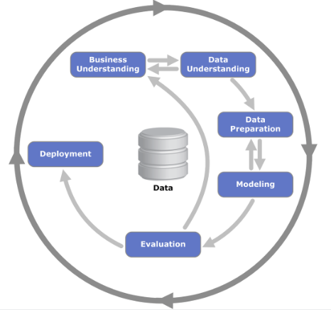
Figure: The CRISP Data Mining Process diagram: it stands for cross industry standard process for data mining. The process was defined in 2000 (Chapman et al. (2000)), well before the modern service-oriented architecture approach to software engineering emerged.
There are formal processes designed for, e.g., data mining, but they are not always appropriate for operational science or continuous deployment. One is the CRISP-DM Chapman et al. (2000) process, which does a nice job of capturing the cyclic nature of these processes but fails to capture the need to build resources that answer questions in real time that occurs in operational science and continuous deployment.
Google Trends
%pip install pytrendsFigure: A Google trends search for ‘data mining,’ ‘data science’ as different technological terms give us insight into their popularity over time.
Google trends gives us insight into the interest for different terms over time.
We note that the term data mining is falling somewhat out of favour, and the CRISP-DM data mining process also feels somewhat dated. In particular software engineering has moved on a great deal since it was defined, with modern software engineering more focused on service-oriented architectures. Software design has a pervasive effect on our ability to do data science.
When thinking about the data science process it is important to consider the software architectures that are used in large-scale decision-making systems and understand what it is that they are bring to help solve these problems.
A more modern view from the O’Reilly book Doing Data Science frames the problem as shown in Figure .
More generally, a data scientist is someone who knows how to extract meaning from and interpret data, which requires both tools and methods from statistics and machine learning, as well as being human. She spends a lot of time in the process of collecting, cleaning, and munging data, because data is never clean. This process requires persistence, statistics, and software engineering skills—skills that are also necessary for understanding biases in the data, and for debugging logging output from code.
Cathy O’Neil and Rachel Strutt from O’Neill and Schutt (2013)
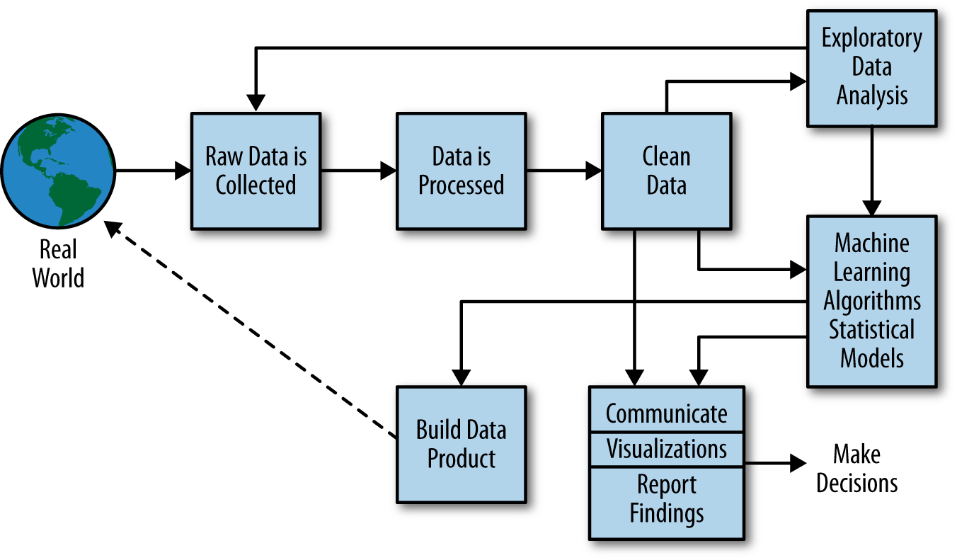
Figure: Another perspective on the data science process, this one from O’Neill and Schutt (2013).
One thing about working in an industrial environment, is the way that short-term thinking actions become important. For example, in Formula One, the teams are working on a two-week cycle to digest information from the previous week’s race and incorporate updates to the car or their strategy.
However, businesses must also think about more medium-term horizons. For example, in Formula 1 you need to worry about next year’s car. So, while you’re working on updating this year’s car, you also need to think about what will happen for next year and prioritize these conflicting needs appropriately.
In the Amazon supply chain, there are equivalent demands. If we accept that an artificial intelligence is just an automated decision-making system. And if we measure in terms of money automatically spent, or goods automatically moved, then Amazon’s buying system is perhaps the world’s largest AI.
Those decisions are being made on short time schedules; purchases are made by the system on weekly cycles. But just as in Formula 1, there is also a need to think about what needs to be done next month, next quarter and next year. Planning meetings are held not only on a weekly basis (known as weekly business reviews), but monthly, quarterly, and then yearly meetings for planning spends and investments.
Amazon is known for being longer term thinking than many companies, and a lot of this is coming from the CEO. One quote from Jeff Bezos that stuck with me was the following.
“I very frequently get the question: ‘What’s going to change in the next 10 years?’ And that is a very interesting question; it’s a very common one. I almost never get the question: ‘What’s not going to change in the next 10 years?’ And I submit to you that that second question is actually the more important of the two – because you can build a business strategy around the things that are stable in time. … [I]n our retail business, we know that customers want low prices, and I know that’s going to be true 10 years from now. They want fast delivery; they want vast selection. It’s impossible to imagine a future 10 years from now where a customer comes up and says, ‘Jeff I love Amazon; I just wish the prices were a little higher,’ [or] ‘I love Amazon; I just wish you’d deliver a little more slowly.’ Impossible. And so the effort we put into those things, spinning those things up, we know the energy we put into it today will still be paying off dividends for our customers 10 years from now. When you have something that you know is true, even over the long term, you can afford to put a lot of energy into it.”
This quote is incredibly important for long term thinking. Indeed, it’s a failure of many of our simulations that they focus on what is going to happen, not what will not happen. In Amazon, this meant that there was constant focus on these three areas, keeping costs low, making delivery fast and improving selection. For example, shortly before I left Amazon moved its entire US network from two-day delivery to one-day delivery. This involves changing the way the entire buying system operates. Or, more recently, the company has had to radically change the portfolio of products it buys in the face of Covid19.
Figure: Experiment, analyze and design is a flywheel of knowledge that is the dual of the model, data and compute. By running through this spiral, we refine our hypothesis/model and develop new experiments which can be analyzed to further refine our hypothesis.
From the perspective of the team that we had in the supply chain, we looked at what we most needed to focus on. Amazon moves very quickly, but we could also take a leaf out of Jeff’s book, and instead of worrying about what was going to change, remember what wasn’t going to change.
We don’t know what science we’ll want to do in five years’ time, but we won’t want slower experiments, we won’t want more expensive experiments and we won’t want a narrower selection of experiments.
As a result, our focus was on how to speed up the process of experiments, increase the diversity of experiments that we can do, and keep the experiments price as low as possible.
The faster the innovation flywheel can be iterated, then the quicker we can ask about different parts of the supply chain, and the better we can tailor systems to answering those questions.
We need faster, cheaper and more diverse experiments which implies we need better ecosystems for experimentation. This has led us to focus on the software frameworks we’re using to develop machine learning systems including data oriented architectures (Cabrera et al. (2023),Paleyes et al. (2022b),Paleyes et al. (2022a),Borchert (2020);Lawrence (2019);Vorhemus and Schikuta (2017);Joshi (2007)), data maturity assessments (Lawrence et al. (2020)) and data readiness levels (See this blog post on Data Readiness Levels. and Lawrence (2017);The DELVE Initiative (2020))
One challenge for data science and data science processes is that they do not always accommodate the real-time and evolving nature of data science advice as required, for example in pandemic response or in managing an international supply chain.
Figure: Data science processes do not always accommodate the real-time and evolving nature of data science advice as required, for example, for policy advice as described in this presentation.
The Fynesse paradigm is inspired by experience in operational data science working with Data Science Africa, deploying in the Amazon supply chain and in the UK Covid-19 pandemic response.
Figure: The challenges of operational data science are closer to the challenges of deploying software and machine learning solutions than a classical analysis. The AutoAI project at Cambridge is focussed on maintaining and explaining AI solutions.
Arguably the challenges for automated data science and deploying complex machine learning solutions are similar. The AutoAI project at Cambridge is focussed on maintaining and explaining machine learning systems. The assumption is that such systems are generally made up of interacting components that make decisions in a composite manner. They have interfaces to the real world where that data is collected, but they also generate data within themselves. The challenge of collecting data is sometimes less the challenge of pacing the streets and more the challenge of extracting it from existing systems.
The Fynesse Framework
The Fynesse paradigm considers three aspects to data analysis: Access, Assess, Address. In this way it builds on many two stage processes that consider data collection and data wrangling to be two separate stages. There are two key differences to the Fynesse process. Firstly, the attempt to separate data wrangling tasks into (a) those that can be done without knowing the downstream task (Assess) and (b) those that can only be done with knowing the downstream task (Address). Naturally, this won’t turn out to be a clean separation. But the ethos is to ensure that any reusable tasks that is done in the process of data wrangling is labelled as such and pushed back into the data ecosystem. Secondly, our use of the term aspects instead of stages acknowledges the fact that although there is a natural ordering to the aspects, we find that in practice the data scientist is often moving quickly across the different aspects, so that the mind set of “stages” can be unhelpful.
Access
The first aspect we’ll consider is accessing the data. Depending on domain, the skills needed to address this challenge will vary greatly. For example, Michael T. Smith was leading a project in collaboration with the Kampala police force to collate accident data.
The access aspect is associated with data readiness level C (Lawrence (2017)).
Crash Map Kampala
The Crash Map Kampala project is a good example of a data science project where a major challenge was access.
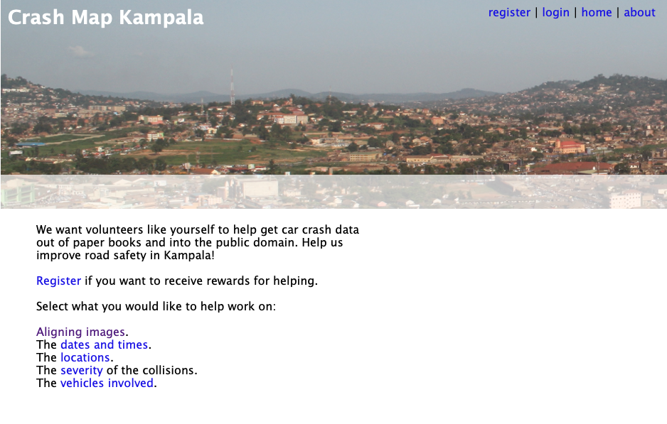
Figure: Crash Map Kampala was an initiative by Michael T. Smith and Bagonza Jimmy Owa Kinyonyi to map the location, date and severity of vehicle accidents across the city of Kampala. Original storage location for the data was in police logbooks.
The project is work from Bagonza Jimmy Owa Kinyony when he was an MSc student and Michael T. Smith when he was based at Makerere University AI-LAB.
The project was inspired by the observation that road traffic accidents are a leading cause of death for the young in many contexts, but the scale of the cause is difficult to compare directly because the number of deaths and serious injuries are difficult to access.
In Kampala this data is stored in logbooks at local police stations. Jimmy was in the Kampala police at the time, so the project focus was transcribing this information into a digital format where it could be mapped.
Due to the scale of the task, the approach of crowd sourcing the work was considered. This approach was also what launched the AI revolution through the ImageNet challenge, where data was labelled through Mechanical Turk (Russakovsky et al. (2015)).
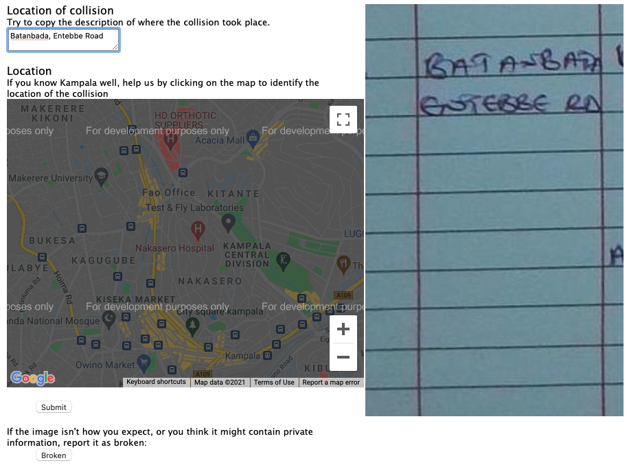
Figure:
But there are additional challenges with this data. The logbooks are typically accessed only by members of Kampala’s police force, in their recording of the accidents. So, permission from the police force was important. Additionally, personal information about those involved in the accidents might have been revealed in the process of crowdsourcing the work.
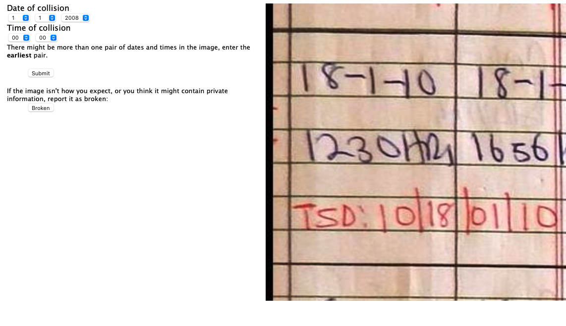
Figure: Alongside the location, the date and time of the crash gives more information that can be used to map crashes over time.
Much of the work here was therefore in the access of the data. Photographing the logbooks, obtaining legal permission from the Kampala police, ensuring that personal information was unlikely to be divulged.
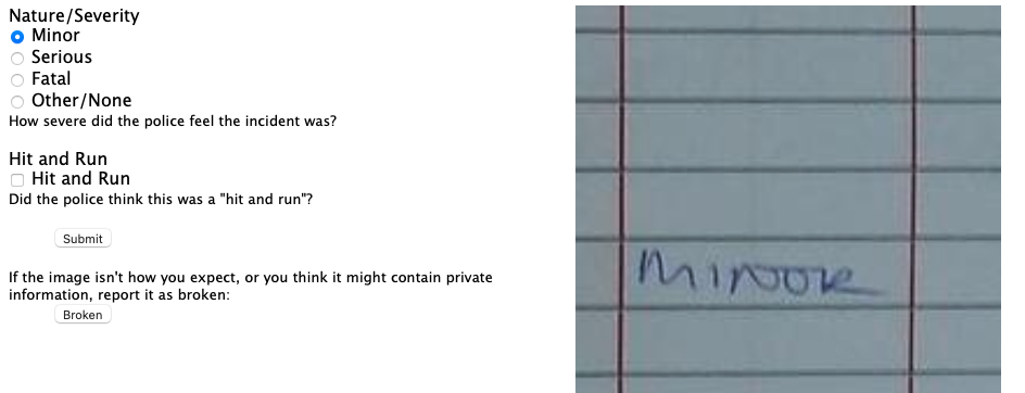
Figure: The severity of the crash is helpful in understanding how people are being affected by road accidents.
As well as software design and build, the work has legal and ethical issues. An important aspect in gaining progress was that Jimmy worked for the Kampala police. Indeed, the work eventually stalled when Jimmy was moved to a different police location.
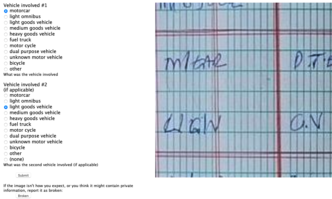
Figure: Understanding which vehicles are involved in accidents could also help with interventions that may be necessary.
The possibility of leaking personal information was reduced, by presenting only a portion of each logbook page to users for analysis. So we can see in Figure the interface for obtaining the location from the logbook. But the date and time (Figure ) the severity of the accident (Figure ) and the vehicles involved (Figure ) are all dealt with in separate parts of the interface.
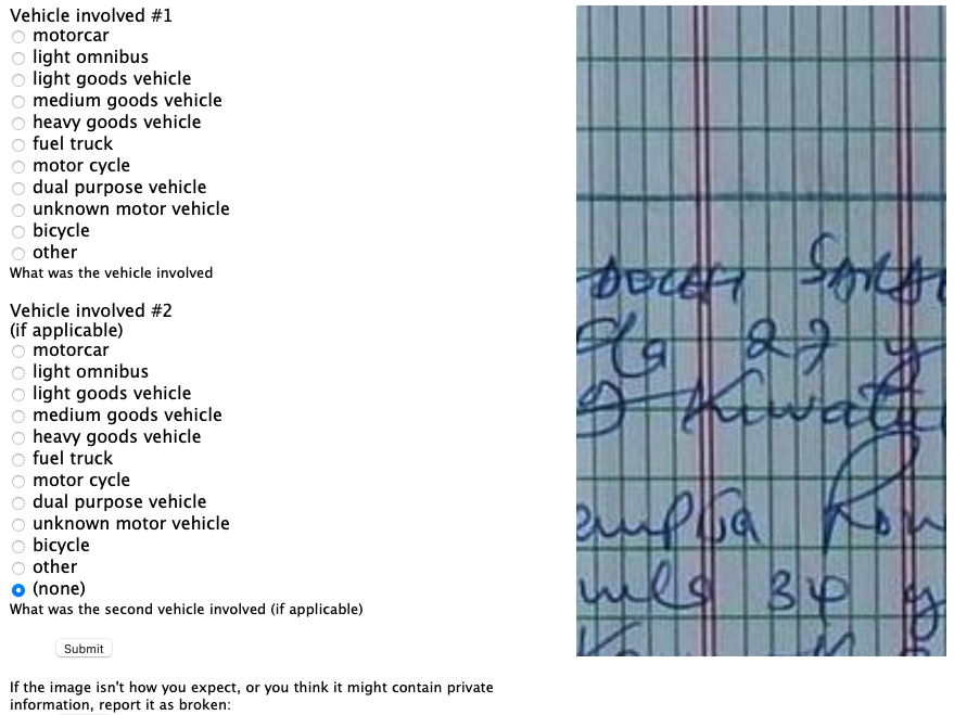
Figure:
It seems a great challenge to automate all the different aspects of the process of data access, but this challenge is underway already through the process of what is commonly called digital transformation. The process of digital transformation takes data away from physical logbooks and into digital devices. But that transformation process itself comes with challenges. For example, the Kampala police force is not currently equipped to store this data in purely digital form. It would require not only devices (which many officers will have access to) but a system of backup and storage that is beyond the capabilities of many organisations.
Legal complications around data are still a major barrier though. In the EU and the US database schema and indices are subject to copyright law. Companies making data available often require license fees. As many data sources are combined, the composite effect of the different license agreements often makes the legal challenges insurmountable. This was a common challenge in the pandemic, where academics who could deal with complex data predictions were excluded from data access due to challenges around licensing. A nice counter example was the work led by Nuria Oliver in Spain who after a call to arms in a national newspaper (Oliver (2020)) was able to bring the ecosystem together around mobility data.
However, even when organisation is fully digital, and license issues are overcome, there are issues around how the data is managed stored, accessed. The discoverability of the data and the recording of its provenance are too often neglected in the process of digital transformation. Further, once an organisation has gone through digital transformation, they begin making predictions around the data. These predictions are data themselves, and their presence in the data ecosystem needs recording. Automating this portion requires structured thinking around our data ecosystems.
Assess
Data that is accessible can be imported (via APIs or database calls or reading a CSV) into the machine and work can be done understanding the nature of the data. The important thing to say about the assess aspect is that it only includes things you can do without the question in mind. This runs counter to many ideas about how we do data analytics. The history of statistics was that we think of the question before we collect data. But that was because data was expensive, and it needed to be explicitly collected. The same mantra is true today of surveillance data. But the new challenge is around happenstance data, data that is cheaply available but may be of poor quality. The nature of the data needs to be understood before its integrated into analysis. Unfortunately, because the work is conflated with other aspects, decisions are sometimes made during assessment (for example approaches to imputing missing values) which may be useful in one context, but are useless in others. So the aim in assess is to only do work that is repeatable, and make that work available to others who may also want to use the data.
The assess aspect renders the Fynesse framework quite different form other data science frameworks that split the process into data wrangling and data modelling. It acknowledges that there is a component to both wrangling and modelling that is specific to the task (this occurs in the address aspect) and a component that is useful across tasks (the assess aspect). This is important in the wider system because any reusable work can be shared. By keeping this uppermost in the mind through the assess aspect, then the wider data ecosystem benefits.
The assess aspect is associated with data readiness level B (Lawrence (2017)).
Case Study: Text Mining for Misinformation
Annotation carried out by seven annotators who could understand both English and Luganda. The data was labeled with the Doccano text annotation tool. Annotations included the data source, the language, the label, the sentiment, and the misinformation status.
Quality assurance performed by reviewing data with an independent team for ensuring annotation guidelines were followed.
Table: Portion of data that was annotated.
| Twitter Data | Facebook Data | |
|---|---|---|
| Initial dataset | 15,354 | 430,075 |
| Dataset after Annotation | 3,527 | 4,479 |
Cohen’s kappa inter-annotation used to measure annotator agreement.
Table: Cohen’s kappa agreement scores for the data.
| Category | Score |
|---|---|
| Language | 0.89 |
| Aspect | 0.69 |
| Sentiment | 0.73 |
| Misinformation | 0.74 |

Figure: Example of data annotation for sentiment and misinformation from the data set.
The idea of the analysis is to bring this information together for sentiment and misinformation analysis in a dashboard for Covid-19 in Uganda.
Automating Assess
There are lots of interesting projects around automating the assessment of the data, for example one can consider automation of schema and data type detection (Valera and Ghahramani (2017)) or the AI for Data Analytics Project (see Nazábal et al. (2020) for an overview of issues and case studies and the video in Figure for details on the project). We may even view projects like the automatic statistician as automating of assessment (James Robert Lloyd and Ghahramani. (2014)), although arguably one could suggest that the choice of data set used in those projects itself is reflective of the question or context. This highlights the difficulty in separating the aspects. The key quesiton to ask in any given context is whether the augmentation you are performing for the data set is going to be helpful or a hindrance to those that may wish to reuse your data.
Figure: The AI for Data Analytics project is an attempt to automate some of the challenges of automated data assessment.
Address
The final aspect of the process is to address the question. We’ll spend the least time on this aspect here, because it’s the one that is most widely formally taught and the one that most researchers are familiar with. In statistics, this might involve some confirmatory data analysis. In machine learning it may involve designing a predictive model. In many domains it will involve figuring out how best to visualise the data to present it to those who need to make the decisions. That could involve a dashboard, a plot or even summarisation in an Excel spreadsheet.
The address aspect is associated with data readiness level A (Lawrence (2017)).
Automating Address
Perhaps the most widespread approach to automating the address aspect is known as AutoML (see video in Figure ). This is an automatic approach to creating ML prediction models. The automatic statistician we mentioned in assess also has some of these goals in mind for automating confirmatory data analysis. But there are clearly other aspects we may wish to automate, particularly around visualization.
Figure: Here Frank Hutter gives a tutorial on AutoML, one of the approaches to automating address.
The emergence of generative AI tools is transforming how we approach the access-assess-address framework, automating many of the previously manual and time-consuming aspects of data science workflows.
GenAI-Enhanced Access
In the access phase, generative AI could help overcome some of the most persistent barriers. Legal compliance around data licensing, which is often a major bottleneck, could be assisted by GenAI tools. LLMs can often operate as enhanced search engines potentially improving data discovery. Perhaps one could identify relevant datasets across multiple repositories and suggest appropriate data sources for specific questions.
GenAI-Enhanced Assess
The assess phase is perhaps where GenAI automation could make the most significant impact. Modern tools can automatically detect data schemas, identify data types, and flag potential quality issues. This automation can ensure that assessment work is more consistent and comprehensive than manual approaches, while also making the results more reusable across different projects. The GenAI can identify patterns that might be missed by human analysts working under time constraints.
GenAI-Enhanced Address
In the address phase, AI tools can automate the generation of insights and their presentation. This includes everything from automated statistical analysis to the generation of appropriate visualisations. The AI can suggest analytical approaches based on the data characteristics and the question being asked, while also generating clear explanations of the results. The danger is that the AI often generates too much information. It should be used for exploration, but confirmation of the analysis path is needed before confirmation.
Current Tools and Integration
Several tools are already demonstrating the potential of this integration. Cursor provides GenAI-assisted code development that’s particularly valuable for data science workflows, offering context-aware suggestions for data manipulation and analysis. GitHub Copilot automates many aspects of code generation and documentation. Google’s Gemini integration with Colab brings GenAI assistance directly into the data analysis environment.
Possible Future Directions
Looking forward, these tools may become more seamlessly integrated into the data science workflow. Rather than being separate applications. But it’s important that the human remains in control, so the interface between human and generative AI becomes extremely important.
It’s also important to consider how the human data scientist will continue to learn. The availability of AI tools means you need to know more about your job, not less! Fortunately the tools can help you with some of the more tedious tasks, so you will have more time to learn.
These tools don’t replace the need for human judgment and domain expertise. Instead, they amplify human capabilities, allowing data scientists to focus on the higher-level aspects of their work while automating routine tasks. The successful data scientist of the future will be one who can effectively leverage these AI tools while maintaining critical thinking about the questions being asked and the validity of the answers being generated.
Fynesse Template
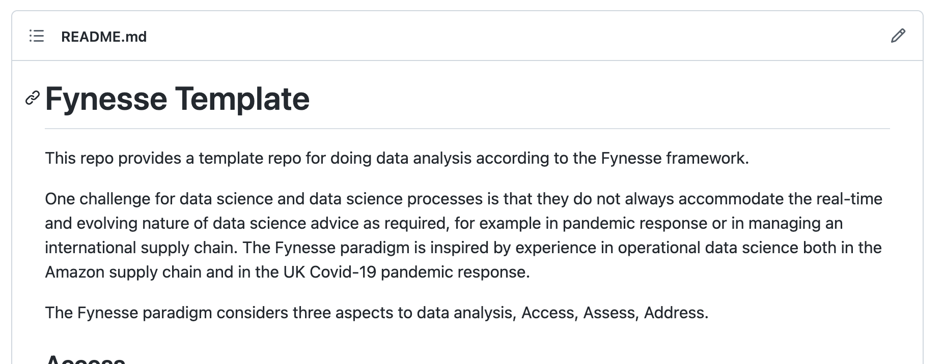
Figure: The Fynesse Template gives you a starting point for building your data science library. You can fork the template, and then create a new repository from the template. You can use that repository for your analysis.
To help you think about the aspects of the Fynesse data science framework, we’ve created a GitHub template that’s available here.
We suggest the following approach to using the template. Firstly: fork the template to your own GitHub account. Then you can base your analysis software on the template. If there are aspects to the template that you think need updating (including things you don’t like!), then you can update those and submit a pull request so that others can benefit.
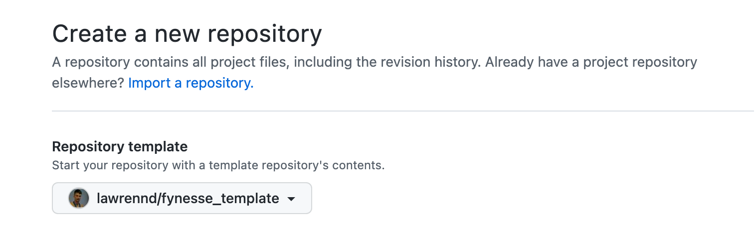
Figure: Setting up a new repository in github from a template. By basing your repository on the fynesse template, you will have a starting point for your analysis framework.
GitHub makes it easy to create a new repository from this framework. Although you should feel free to use your own tools for source code control if you find them more convenient.
Data Process Conclusions
Building Data Narratives
Building Data Narratives
In this course, we’d like our data narratives to be inspired by data journalism. But there are important differences. While both benefit from narrative structure, journalists normally seek human stories and societal impact, data scientists tell data stories. Data narratives also hope for societal impact, but often through a story of discovery and understanding, never through sensationalising or misrepresenting.
Context for a data scientist establishes why this particular dataset or question is worth investigating. It might be a business problem, a scientific hypothesis, or simply curiosity about patterns in available data.
Investigation —this is your analytical journey through the data. What patterns emerged? What hypotheses did you test? What surprised you during exploration?
Understanding is your resolution—the new knowledge or insights gained from your analysis. This might be a predictive model, a deeper understanding of relationships in the data, or even the discovery that your initial assumptions were wrong.
The data science hook might be an unexpected correlation you discovered, a counterintuitive pattern, or simply a well-posed analytical question. The setup explains your data sources, methodology, and analytical approach—transparency that builds trust.
The journey is crucial in data science narratives: show your analytical process, including false starts and iterative refinements. This isn’t just methodological transparency—it’s storytelling that helps readers understand how insights emerge from data.
Your insights should be presented with appropriate uncertainty and caveats. Unlike in normal story telling, data science narratives often conclude with “this suggests…” rather than definitive statements. The implications focus on how your analysis advances understanding or could inform future decisions.
Narrative Techniques for Data Science Stories
Data science narratives require techniques that help audiences follow your analytical reasoning and understand the insights you’ve discovered:
Show your analytical thinking means using visualisations to reveal how you reasoned through the data, not just what you concluded. Each chart should help readers understand what you learned at that step of your analysis.
Unlike journalism, where polished final visualisations dominate, data science narratives benefit from showing exploratory analysis. A scatter plot that reveals an unexpected relationship, a histogram that shows your data isn’t normally distributed, or a time series that reveals seasonal patterns—these exploratory visualizations tell the story of discovery.
Progressive disclosure in data science means starting with your most compelling finding to hook readers, then building the analytical complexity step by step. Don’t lead with methodology—lead with discovery.
For example, start with “Customer churn increases 40% in winter months” before explaining your survival analysis methodology. Once readers are invested in the finding, they’ll follow you through the technical details of how you discovered it.
Ground in concrete examples means using specific data points to make abstract patterns tangible. Instead of just reporting “correlation coefficient of 0.73,” show specific examples: “When temperature increased by 10°C, ice cream sales increased by an average of 15 units.”
This isn’t about human interest stories—it’s about making statistical relationships concrete and understandable. Show both the forest (aggregate patterns) and individual trees (specific cases that illustrate those patterns).
Visualisation for Storytelling
Effective data visualization for storytelling goes beyond simply choosing the right chart type. Every visual element—from color choices to annotation placement—contributes to the narrative.
Chart choice fundamentally shapes the story you tell. A line chart emphasizes change over time and can suggest causation or trends. Bar charts focus attention on comparisons and rankings. Scatter plots reveal relationships and help identify outliers or unexpected patterns.
Consider the same dataset shown as a line chart (emphasizing trends) versus a bar chart (emphasizing comparisons) versus a map (emphasizing geographic patterns)—each tells a different story from the same underlying data.
Annotations are your storytelling superpower. They guide readers’ attention to the most important insights and provide context that might not be obvious from the data alone. Good annotations explain not just what happened, but why it matters.
The New York Times’ data visualizations excel at this—they use arrows, callout boxes, and explanatory text to ensure readers don’t miss key insights, even in complex multi-panel displays.
Colour is a powerful narrative device that can emphasize key findings, group related elements, or create emotional associations. However, it must be used thoughtfully—consider accessibility for color-blind readers, maintain consistency across related visualizations, and be aware of cultural associations (red for danger, green for growth, etc.).
Reuters Graphics demonstrates masterful use of color in their climate change visualizations, using warming colors (reds and oranges) to represent temperature increases in ways that are both scientifically accurate and emotionally resonant.
Learning from Data Journalism
Data journalism offers valuable lessons for data scientists, not in content but in craft. Journalists excel at structuring complex information, making technical analysis accessible, and maintaining audience engagement. However, the purposes differ fundamentally.
Data journalists typically seek to inform the public, drive policy changes, or expose societal issues. Data scientists aim to understand patterns, build predictive models, or generate insights that advance knowledge or business objectives. This difference in purpose shapes how we tell our stories.
These journalism examples offer techniques we can adapt for data science narratives:
Data collection transparency: The Guardian’s project showed how data was gathered, what was missing, and why that mattered. In data science, explaining your data sources, cleaning processes, and limitations builds credibility.
Multiple perspectives: The New York Times presented COVID data at national, state, and individual levels. Data scientists can similarly show both forest and trees—aggregate patterns and individual cases that illustrate those patterns.
Accessible complexity: ProPublica made sophisticated statistical analysis understandable to general audiences without sacrificing rigor. Data scientists can explain complex methods clearly while maintaining technical accuracy.
We can adapt story-telling techniques while staying true to data science purposes:
Data drama comes from unexpected findings—correlations that shouldn’t exist, models that fail in interesting ways, or null results that challenge assumptions. To data scientists analytical surprises can be just as engaging as human drama. But they shouldn’t be presented as a murder mystery. There is no need for building suspense. Keep the reader informed.
Analytical insights rWhat does your analysis reveals about underlying systems, processes, or relationships in the data.
Informed understanding how can you help readers understand your system better, or how can you help them approach similar analytical problems more effectively.
Resources for Data Science Storytelling
To develop your data science storytelling skills, study examples across multiple domains. Data journalism teaches narrative structure and clarity. Academic papers demonstrate rigorous methodology presentation. Technical blogs show how to make complex concepts accessible. Kaggle kernels exemplify transparent analytical processes.
Essential books for data science communication:
“The Truthful Art” by Alberto Cairo emphasizes creating honest, effective visualisations—crucial for data scientists who must present findings accurately.
“Storytelling with Data” by Cole Nussbaumer Knaflic provides practical techniques for presenting analytical results clearly and compellingly.
“The Visual Display of Quantitative Information” by Edward Tufte offers timeless principles for clear, informative data presentation.
Key online resources for data scientists:
Distill.pub demonstrates how to explain complex machine learning concepts through interactive visualizations and clear prose.
Technical blogs (R-bloggers, Towards Data Science) can show how practitioners explain their analytical processes and findings. Although in an effort to seek clicks many “Towards Data Science” blogs are simplistic and superficial.
Kaggle Learn courses provide examples of structured analytical narratives with code and explanations.
Study these examples of effective analytical narratives:
Kaggle competition write-ups demonstrate how to explain analytical processes clearly, showing the reasoning behind feature engineering, model selection, and validation strategies.
Distill.pub articles excel at making complex machine learning concepts accessible through interactive visualizations and clear explanations—perfect examples of data science storytelling.
Academic reproducibility studies show how to present methodology transparently while maintaining rigor—essential skills for data science narratives.
Company tech blogs (Netflix, Spotify, Airbnb) demonstrate how to present business insights derived from data analysis in compelling, actionable ways.
Open source project documentation provides examples of explaining technical work clearly to diverse audiences with varying levels of expertise.
Effective data science narratives share these characteristics:
Transparency means showing your analytical reasoning, including false starts and iterative refinements. Readers trust conclusions more when they understand the process.
Honesty about limitations and uncertainty builds credibility. Unlike journalism, data science narratives should embrace uncertainty and present confidence levels explicitly.
Clarity in explaining complex methods without sacrificing accuracy. Your audience may include both technical and non-technical stakeholders.
Reproducibility means providing enough methodological detail that others could replicate or build upon your work.
Insight focus emphasizes what you learned from the data, not just the techniques you applied. The story is about discovery and understanding, not methodology for its own sake.
Building Narratives for Your Mini Projects
Your mini projects provide an excellent opportunity to practice building data narratives. The Access-Assess-Address framework naturally lends itself to storytelling, with each phase offering different narrative opportunities.
The Access phase is your data story’s foundation. Why did you choose this particular dataset? What challenges did you encounter in obtaining or cleaning the data? These challenges often reveal important insights about the data’s limitations and biases. They may also include important social issues such as legal or ethical issues.
For example, if you’re working with social media data, explain the API limitations, sampling biases, and temporal constraints. What might the ethical implicatiosn be of unrepresentative data? This isn’t just methodological transparency—it’s storytelling that helps readers understand what your analysis can and cannot reveal. Missing data often tells as interesting a story as the data you have.
The Assess phase is your analytical journey. This is where you take readers through your exploration—what patterns emerged? What surprised you? How did your understanding evolve as you dug deeper?
Embrace the messiness of real data analysis. Show the dead ends, the assumptions that were wrong, the patterns that disappeared under closer scrutiny. This isn’t failure—it’s the authentic process of learning from data. Your audience will trust your final insights more if they’ve seen your analytical reasoning.
The Address phase is your analytical resolution. What key insights emerged from your analysis? Be honest about your confidence levels and limitations. What questions remain unanswered? How does your work advance understanding in this domain?
Unlike journalism, your “call to action” is often intellectual rather than practical: “This suggests we should reconsider our assumptions about X” or “Future work should investigate Y.” The goal is advancing understanding, not necessarily driving immediate action.
Structure your mini project presentation as a data science narrative:
Hook: Start with your most compelling analytical finding—an unexpected correlation, a surprising null result, or an intriguing pattern that emerged from exploration.
Context: Establish why this dataset and analytical question are worth pursuing. This might be scientific curiosity, business relevance, or methodological interest.
Journey: Show your analytical process authentically—the hypotheses you tested, the methods you tried, the dead ends you encountered. This transparency builds credibility.
Insights: Present your findings with appropriate caveats and confidence levels. Use visualizations that reveal your analytical thinking, not just polished results.
Understanding: Focus on how your analysis advances understanding of the domain or analytical approach. What would you investigate next? What assumptions should be reconsidered?
Thanks!
For more information on these subjects and more you might want to check the following resources.
- company: Trent AI
- book: The Atomic Human
- twitter: @lawrennd
- podcast: The Talking Machines
- newspaper: Guardian Profile Page
- blog: http://inverseprobability.com