Narratives, Science and Data
Dedan Kimathi University, Nyeri, Kenya
Communication Bandwidth
- Human communication: walking pace (2000 bits/minute)
- Machine communication: light speed (billions of bits/second)
- Our sharing walks, machine sharing …
Evolved Relationship with Information
New Flow of Information
Evolved Relationship
Evolved Relationship
Evolved Relationship
Data Context
- Must not forget context of data.
- Three challenges:
- Paradoxes of Data Society
- Quantifying value of data
- Privacy, loss of control and marginalization
- Place people at the heart.
Generative AI
Human Analogue Machine
HAM
Data Science in Practice
Data Science as Debugging
- Analogies: For Software Engineers describe data science as debugging.
80/20 in Data Science
- Anecdotally for a given challenge
- 80% of time is spent on data wrangling.
- 20% of time spent on modelling.
- Many companies employ ML Engineers focussing on models not data.
Lessons
- When you begin an analysis behave as a debugger
- Write test code as you go.
- document tests … make them accessible.
- Be constantly skeptical.
- Develop deep understanding of best tools.
- Share your experience of challenges, have others review work
Lessons
- When managing a data science process.
- Don’t deploy standard agile development. Explore modifications e.g. Kanban
- Don’t leave data scientist alone to wade through mess.
- Integrate the data analysis with other team activities
- Have software engineers and domain experts work closely with data scientists
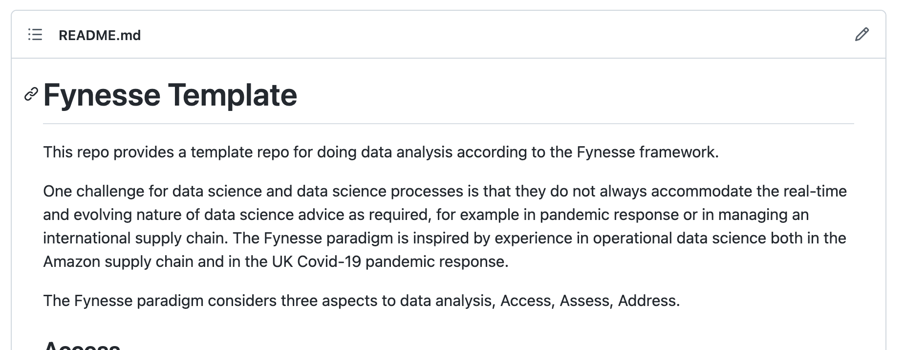
The Fynesse Framework
- Access
- Assess
- Address
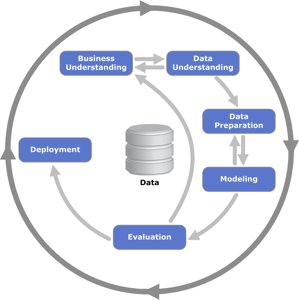
CRISP-DM
Google Trends
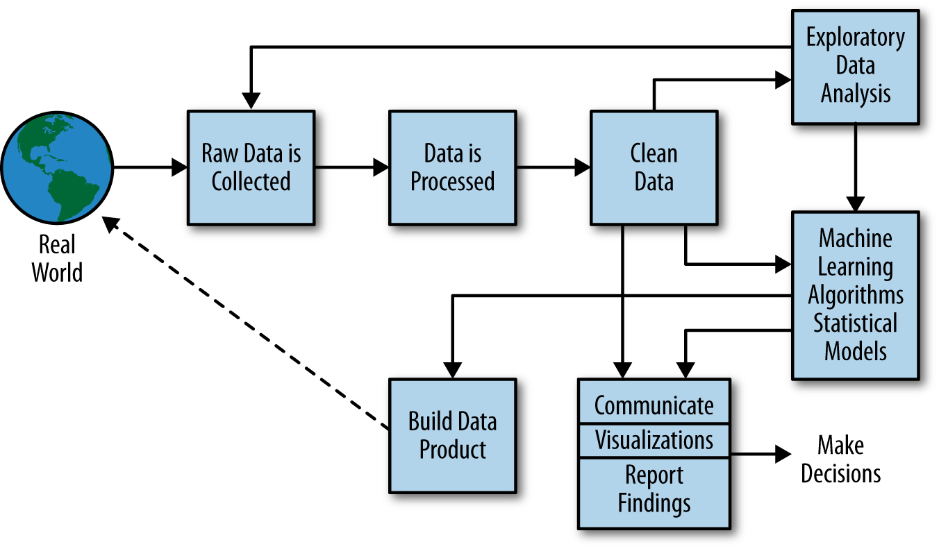
More generally, a data scientist is someone who knows how to extract meaning from and interpret data, which requires both tools and methods from statistics and machine learning, as well as being human. She spends a lot of time in the process of collecting, cleaning, and munging data, because data is never clean. This process requires persistence, statistics, and software engineering skills—skills that are also necessary for understanding biases in the data, and for debugging logging output from code.
Cathy O’Neil and Rachel Strutt from O’Neill and Schutt (2013)
Experiment, Analyze, Design
A Vision
We don’t know what science we’ll want to do in five years’ time, but we won’t want slower experiments, we won’t want more expensive experiments and we won’t want a narrower selection of experiments.
What do we want?
- Faster, cheaper and more diverse experiments.
- Better ecosystems for experimentation.
- Data oriented architectures.
- Data maturity assessments.
- Data readiness levels.
Inspiration
- Operational data science with:
- Data Science Africa
- Amazon (particularly in supply chain)
- The Royal Society DELVE Group (pandemic advice)
The Fynesse Framework
- Three aspects
- Access - before data is available electronically
- Assess - work that can be done without the question
- Address - giving answers to question at hand
Access
- Work to make data electronically accessible.
- Legal work
- Ethical work
- Extraction of data form where it’s held
- mobile phones, within software ecosystem, physical log books
- Associated with data readiness level C.
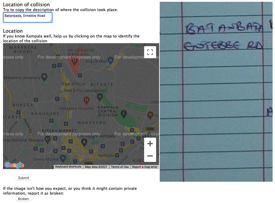
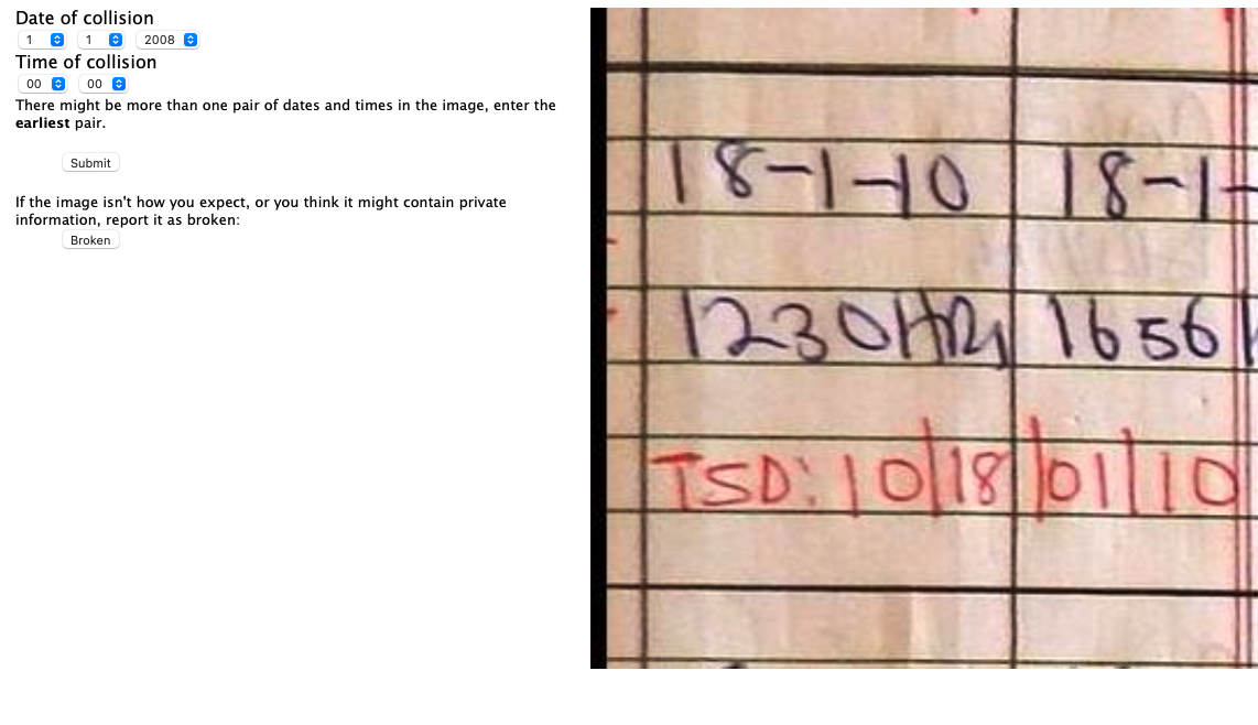
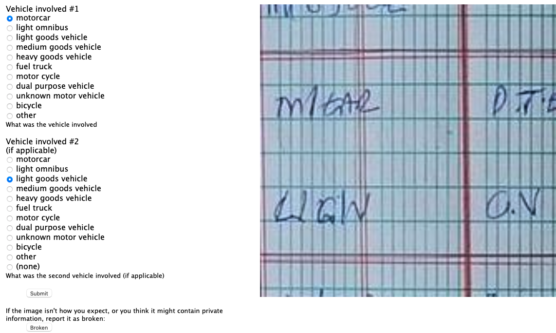
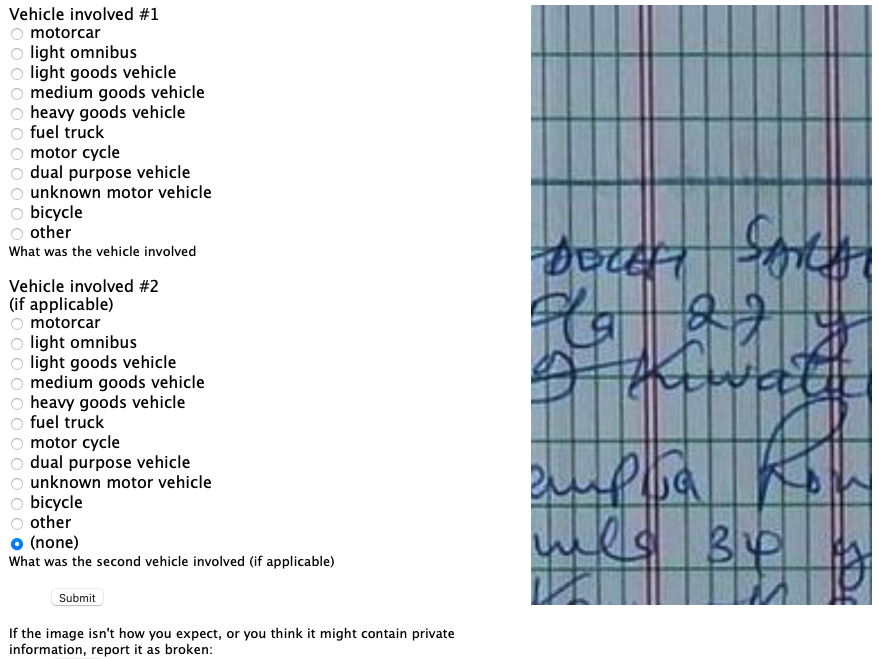
Access Case Study: Crash Map Kampala
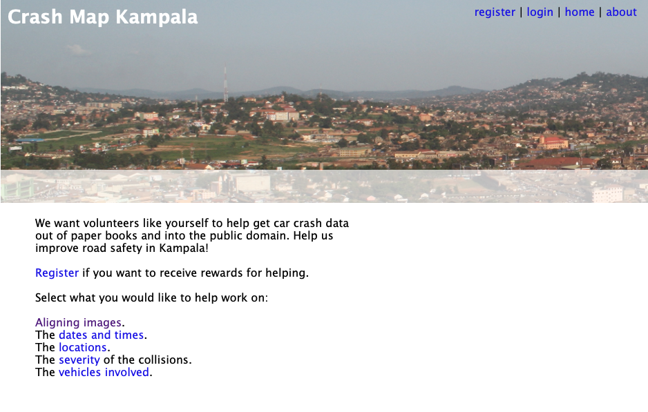
Crash Map Kampala

Access Automation
- Digital Transformation
- Post-Digital Transformation
Assess
- Only things you can do without knowing the “question.”
- This ensures assess is reusable across tasks.
- Driven by happenstance data.
- Associated with data readiness level B
Case Study: Text Mining for Covid Misinformation
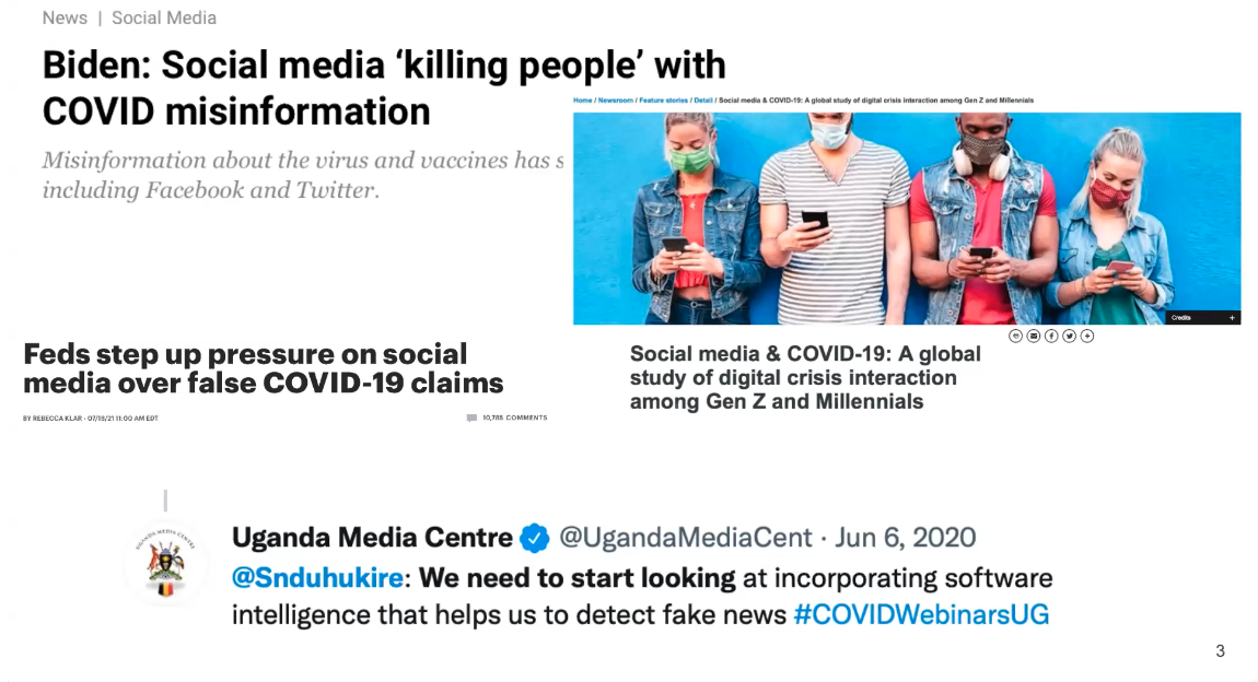
Case Study: Text Mining for Misinformation
Table: Portion of data that was annotated.
| Twitter Data | Facebook Data | |
|---|---|---|
| Initial dataset | 15,354 | 430,075 |
| Dataset after Annotation | 3,527 | 4,479 |

Cohen’s kappa inter-annotation used to measure annotator agreement.
Table: Cohen’s kappa agreement scores for the data.
| Category | Score |
|---|---|
| Language | 0.89 |
| Aspect | 0.69 |
| Sentiment | 0.73 |
| Misinformation | 0.74 |

Automating Assess
- Automated scheme detection
- Automated data type detection (Valera and Ghahramani (2017))
- The automatic statistician (James Robert Lloyd and Ghahramani. (2014))
- AI for Data Analytics (Nazábal et al. (2020))
- Joyce’s case study gives us also POS tagging for new languages.
AI for Data Analytics
Address
- Address the question.
- Now we bring the context in.
- Could require:
- Confirmatory data analysis
- An ML prediction model
- Visualisation through a dashboard
- An Excel spreadsheet
- Associated with data readiness level A.
Automating Address
- Auto ML
- Automatic Statistician
- Automatic Visualization
AutoML
Generative AI Automation of Access-Assess-Address
- Access: AI-assisted data discovery and legal compliance
- Assess: Automated schema detection and data quality assessment
- Address: AI-powered analysis and visualization generation
- Integration: Tools like Cursor, GitHub Copilot, and Gemini in Colab
GenAI-Enhanced Access
- Legal Compliance: GenAI tools might help navigate complex licensing and data governance requirements
- Data Discovery: Automated identification of relevant datasets across multiple sources, GenAI tools as enhanced search
- API Integration and Creation: GenAI-assisted development of data connectors and extraction pipelines (boilerplate)
- Document Processing: Converting physical documents and unstructured data into machine-readable formats: text as data
GenAI-Enhanced Assess
- Schema Detection: Automated identification of data types, relationships, and quality issues
- Data Profiling: GenAI-generated summaries of data characteristics and potential problems
- Quality Assessment: Automated detection of missing values, outliers, and inconsistencies
- Metadata Generation: GenAI-assisted creation of comprehensive data documentation
GenAI-Enhanced Address
- Analysis Automation: GenAI-generated statistical summaries and exploratory analysis
- Model Selection: Automated recommendation of appropriate analytical approaches
- Visualisation: GenAI-generated charts and dashboards give ability for quick exploration
- Interpretation: AI-assisted explanation of results and their implications
Current Tools and Integration
- Cursor: GenAI-assisted code development with context-aware suggestions
- GitHub Copilot: Automated code generation and documentation
- Gemini in Colab: Integrated GenAI assistance for data analysis workflows
Possible Future Directions
- Seamless Integration: more natural interaction between GenAI and human
- Domain Specialization: tools tailored to specific data science areas
- Collaborative AI: systems that work alongside human data scientists
- Continuous Learning: for human and AI. Need to know more about the job, not less
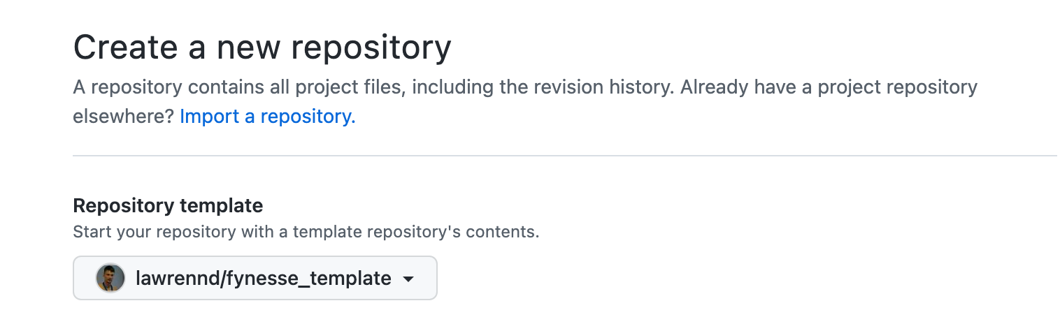
Fynesse Template
Create Repository from Template
Data Process Conclusions
- Bandwidth constraints of humans
- Big Data Paradox
- Big Model Paradox
- Access, Assess, Address
Building Data Narratives
Building Data Narratives
- Every dataset has a story to tell
- Data science narratives vs journalism narratives:
- Journalism: Human drama, societal impact, calls to action
- Data Science: Analytical journey, patterns discovered, insights gained
- Three key elements remain:
- Context - Why is this data worth exploring?
- Investigation - What did you discover in the data?
- Understanding - What new knowledge emerged?
The Data Science Narrative Arc
- Hook - An intriguing pattern, unexpected finding, or compelling question
- Setup - The dataset, methodology, and analytical approach
- Journey - Your path through the data: dead ends, discoveries, iterations
- Insights - What the data revealed, with evidence and uncertainty
- Implications - How this advances understanding or informs decisions
Narrative Techniques for Data Science Stories
- Show your analytical thinking - Let visualizations reveal your reasoning
- Use progressive disclosure - Build complexity gradually
- Ground in concrete examples - Use specific cases to illustrate patterns
- Acknowledge uncertainty - Be honest about limitations and confidence levels
- Focus on insights - What new understanding emerged from your analysis?
Show Your Analytical Thinking
- Visualisations should reveal your reasoning process
- Each chart should answer: “What did I learn from this?”
- Show exploratory analysis, not just final results
- Use annotations to explain what you’re seeing
Progressive Disclosure
- Start with your key finding or most interesting pattern
- Build analytical complexity step by step
- Show your methodology after establishing interest
- Provide detail for those who want to dig deeper
Ground in Concrete Examples
- Use specific data points to illustrate patterns
- Show individual cases alongside aggregate statistics
- Make abstract concepts concrete through examples
- Balance the general with the particular
Visualisation for Storytelling
- Chart choice drives narrative - Different charts tell different stories
- Colour and annotation guide attention - Direct the reader’s eye
- Sequence matters - Order of presentation shapes understanding
- Context is crucial - Baselines, comparisons, and reference points
Chart Choice and Story
- Line charts: Change over time, trends, trajectories
- Bar charts: Comparisons, rankings, categories
- Scatter plots: Relationships, correlations, outliers
- Maps: Geographic patterns, spatial relationships
- Small multiples: Comparisons across groups
The Power of Annotation
- Highlight key insights directly on charts
- Provide context for unusual data points
- Guide readers through complex visualizations
- Explain methodology and limitations
Color as Narrative Device
- Use color to highlight key findings
- Maintain consistency across related charts
- Consider accessibility and color blindness
- Leverage cultural associations thoughtfully
Learning from Data Journalism
- Journalism inspiration for data science narratives:
- Structure: Clear narrative arc and progression
- Clarity: Making complex analysis accessible
- Transparency: Showing methodology and limitations
- Engagement: Keeping audience interested throughout
- Key difference: Purpose
- Journalism: Inform public, drive action, expose issues
- Data Science: Understand patterns, build models, generate insights
Example: Narrative Techniques from Journalism
- The Guardian’s “The Counted”: Data collection as storytelling
- Lesson: Transparency about data sources and methodology
- Application: Explain how you gathered and cleaned your data
- New York Times COVID-19: Multiple scales and perspectives
- Lesson: Present data at different levels of detail
- Application: Show both individual observations and aggregate patterns
- ProPublica’s “Machine Bias”: Statistical rigor with clear explanation
- Lesson: Complex analysis can be made accessible
- Application: Explain your statistical methods in plain language
Adapting Journalism Techniques for Data Science
- From human drama to data drama:
- Unexpected correlations, surprising null results, model failures
- From societal impact to analytical insight:
- What this reveals about the underlying system or process
- From calls to action to informed understanding:
- How this changes what we know or how we might approach similar problems
Resources for Data Science Storytelling
- Learn narrative techniques from:
- Data journalism (structure and clarity)
- Academic papers (rigor and methodology)
- Technical blogs (accessible explanations)
- Kaggle kernels (analytical transparency)
- Focus on: How they explain complex analysis clearly
Essential Reading for Data Scientists
- Books for clear communication:
- “The Truthful Art” by Alberto Cairo (honest visualization)
- “Storytelling with Data” by Cole Nussbaumer Knaflic (presentation techniques)
- “The Visual Display of Quantitative Information” by Edward Tufte (design principles)
- Online resources:
- Distill.pub (interactive explanations of ML concepts)
- R-bloggers and Python blogs (analytical narratives)
- Kaggle Learn courses (structured learning with examples)
Examples of Analytical Narratives
- Kaggle competition write-ups: Clear analytical processes
- Distill.pub articles: Complex concepts made accessible
- Academic reproducibility studies: Transparent methodology
- Company tech blogs: Business insights from data
- Open source project documentation: Clear explanations of technical work
What Makes Data Science Narratives Effective
- Transparency: Show your analytical reasoning
- Honesty: Acknowledge limitations and uncertainty
- Clarity: Make complex methods understandable
- Reproducibility: Provide enough detail for others to follow
- Insight: Focus on what you learned, not just what you did
Building Narratives for Your Mini Projects
- Apply the Access-Assess-Address framework narratively
- Each phase has storytelling opportunities:
- Access: The quest for data
- Assess: Discovery and exploration
- Address: Insights and implications
Access: The Quest for Data
- Why this dataset? What drew you to it?
- What challenges did you face in obtaining/cleaning the data?
- What surprised you about the data collection process?
- How does the data’s origin affect its reliability?
Assess: Discovery and Exploration
- What patterns emerged during exploration?
- Which findings surprised you?
- What assumptions were challenged?
- How did your understanding evolve?
- What dead ends did you encounter?
Address: Insights and Understanding
- What key insights emerged from your analysis?
- How confident are you in these findings?
- What are the limitations and caveats?
- What questions remain unanswered?
- How does this advance understanding of the domain?
Data Science Narrative Structure for Mini Projects
- Hook: Start with your most intriguing pattern or unexpected finding
- Context: Why is this dataset worth exploring? What question drove your analysis?
- Journey: Take readers through your analytical process, including false starts
- Insights: Present key findings with appropriate uncertainty and evidence
- Understanding: How does this advance knowledge? What would you explore next?
Thanks!
company: Trent AI
book: The Atomic Human
twitter: @lawrennd
The Atomic Human pages human-analogue machine (HAMs) 343-347, 359-359, 365-368 .
newspaper: Guardian Profile Page
blog posts: