Introduction
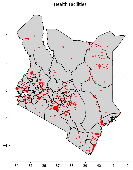
Every Kenyan has the right to education and healthcare, yet access to these essential services remains unequal across the country. Using data from the 2019 Census and Kenya’s school and hospital registries, I explored whether facilities are distributed fairly relative to population size, and what this means for communities’ everyday lives.
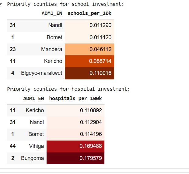
Regions like Kericho, Nandi, and Mandera remain underserved, while urban areas such as Nairobi and Kiambu have dense concentrations of schools and hospitals. This project combines geospatial data, statistical analysis, and visualisation to reveal these disparities and spark conversations around equity in essential infrastructure.
Understanding Kenya’s Population Landscape
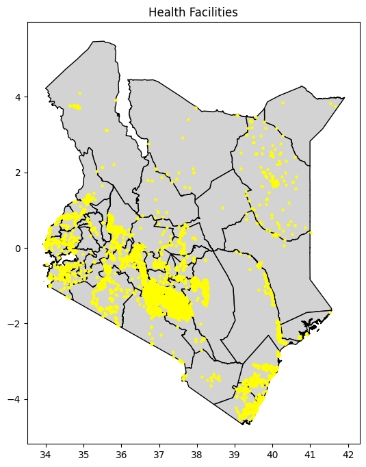
Using county-level census data, we visualised population distribution across Kenya. The map revealed sharp contrasts between densely populated counties like Nairobi and Kiambu, and the sparsely inhabited northern regions such as Turkana and Marsabit. These variations form the backdrop to Kenya’s service delivery challenge - where distance and density shape access.
Facilities vs Population: A Growing Imbalance
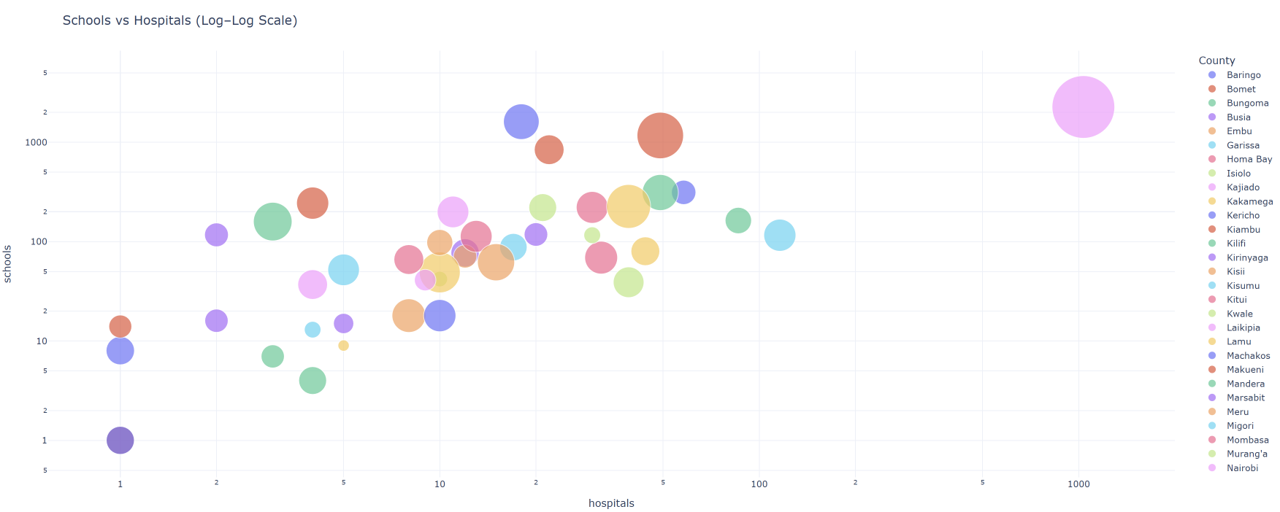
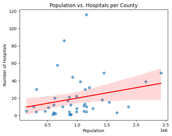
When comparing the number of schools and hospitals against population, the disparities become even clearer. Counties with high populations often have relatively fewer public facilities, meaning more people compete for fewer services. To visualise this imbalance, we created a bubble plot of the number of hospitals and schools, where each bubble’s size represents population.
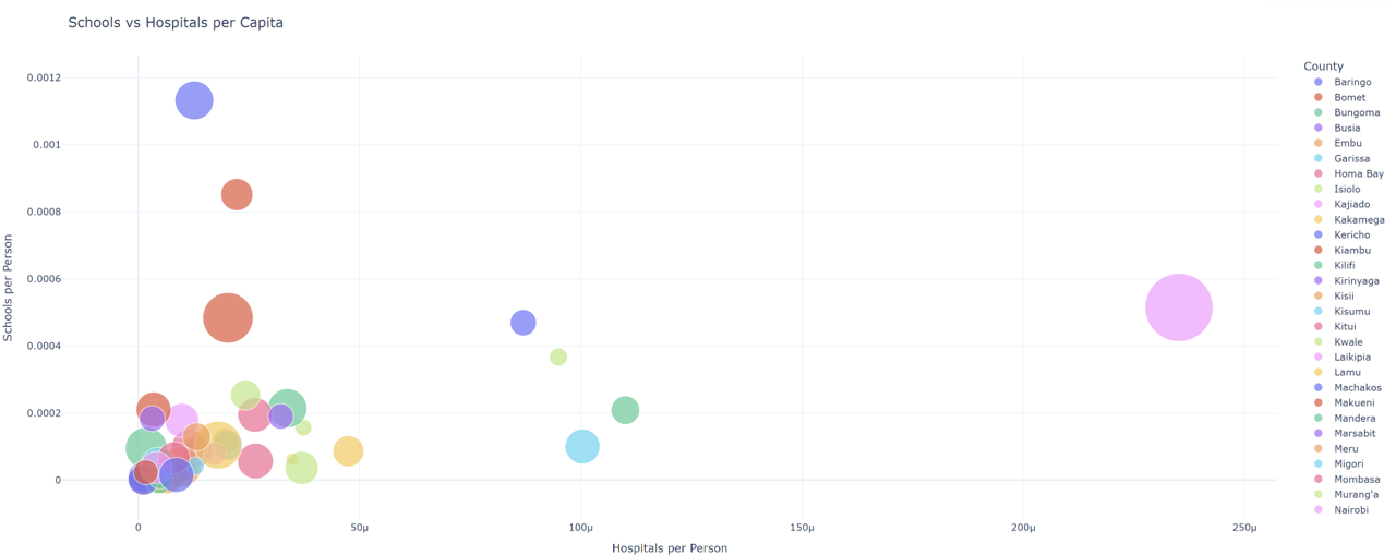
The data was also plotted per capita. Bubbles towards the top-right show better alignment between population and facilities, while the ones near the origin highlight underserved regions.
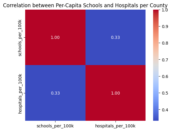
Correlation Analysis
A correlation study revealed:
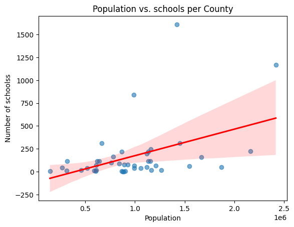
- Population is strongly correlated with the number of schools and hospitals.
- Counties with larger land areas tend to have lower facility density.
- Hospitals correlate strongly with schools.
- Per-capita school and hospital counts vary between counties.
What the Data Reveals
The bubble plot and correlation analysis tell a clear story: population correlates moderately with the number of schools, but less so with hospitals. This means that while educational facilities have somewhat scaled with growth, healthcare infrastructure has lagged. Counties like Mandera and Wajir, for example, show high population but very few hospitals per capita.
These patterns echo real-world experiences - families travelling long distances for healthcare, and overcrowded classrooms in fast-growing towns. Such insights underline the value of data-driven planning for equitable access.
Conclusion
Access to essential facilities in Kenya remains uneven, but data gives us a way forward. By identifying where the gaps are largest, policymakers and communities can target interventions that bring services closer to the people who need them most. Ultimately, building a fairer Kenya requires more than infrastructure - it requires insight, compassion, and collaboration between data and humanity.
About the Machine Learning Foundations Course (MLFC)
The Machine Learning Foundations Course (MLFC) is a program developed under the guidance of Prof. Neil Lawrence at the University of Cambridge, hosted at Dedan Kimathi University of Technology (DeKUT), Nyeri, Kenya. It prepares learners with essential mathematical and probabilistic foundations to engage with advanced machine learning topics. The course emphasises the application of ML to real-world challenges, empowering students to use data for community-focused problem solving.
Personal Reflection: Learning from Data and Community
One of the most rewarding parts of the Machine Learning Foundations Course (MLFC) was how each lecture built up from mathematical ideas into real-world applications. What stood out most for me was how Prof. Neil Lawrence showed that machine learning is not just about algorithms, it’s about reasoning under uncertainty, using data to make informed and responsible decisions.
The lectures began with probability, which forms the foundation of all machine learning. We explored how probabilities describe uncertainty, through distributions, expectations, and independence, and how rules like the product and sum rule connect different events. For me, this was eye-opening because it explained why models can adapt as new data arrives, which is essential when dealing with real-world datasets like Kenya’s census and facility records that are never perfectly complete.
We then moved into linear algebra, which I had seen before, but never quite this way. We used it to understand how data can be represented as matrices and how optimisation works in regression models. The link between minimising loss and maximising likelihood made everything click, I could now see how equations translate into decisions a model makes. When I later analysed how population size affects the number of schools, this understanding helped me interpret the regression relationships meaningfully, not just technically.
The introduction to Gaussian Processes was another highlight. Prof. Neil described them as models that don’t just give predictions, but also tell you how sure they are. That idea really stayed with me. In the context of my project, if a model predicts that a county is underserved, it’s equally important to know how confident that prediction is, especially when such insights could guide policy or investment.
We also covered unsupervised learning, where the goal isn’t to predict but to discover. Learning how clustering algorithms like k-means or hierarchical clustering group data without labels helped me think about how to categorise counties by their level of access to services. We also discussed challenges like the “curse of dimensionality”, when too many features make data harder to interpret, and how dimensionality reduction can help reveal clearer structure.
Machine learning starts with mathematics, but it grows into empathy and responsibility.