

How School Distribution Shapes Education in Kenya
Introduction
I come from Nyandarua, a county in central Kenya that lags behind neighbouring counties such as Nyeri, Kiambu and Nakuru in education. Nyandarua has only two national high schools, a few extra-county schools, and no university. For many students, this means leaving the county to pursue both secondary and higher education elsewhere. Like many other counties in Kenya, quality educational institutions are unevenly distributed. This context inspired me to analyze how school distribution affects educational outcomes at the county level and shapes long-term opportunities across Kenya. Working on this project allowed me to apply the analytical methods we explored in the MLFC program to a real-world issue that is important to me. It also strengthened my understanding of how data-driven approaches can be used to inform policy and contribute to improving equity in education.
Background
In September, I undertook the Machine Learning Foundations course led by Professor Neil Lawrence at the Centre for Data Science and Artificial Intelligence Lab, Dedan Kimathi University of Technology. The course provided a broad introduction to machine learning, covering statistical models, probability, Gaussian processes, and other foundational concepts. It also included practical sessions by Radzim Sendyka and Frederick Lawrence, which offered hands-on experience using NumPy and Pandas, building models, and following best practices for organising code with the Fynesse model. These concepts proved particularly important in carrying out this project and interpreting the results.
The Process: Access, Assess, Address
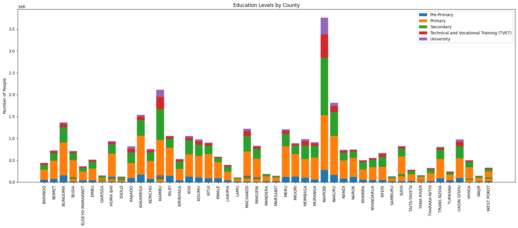
The project follows the Fynesse pipeline in three stages. Access was the most challenging. I initially planned to work at the sub-county level, but reliable data simply was not available. I had to extract school information from multiple websites and PDFs. I also obtained the 2019 Census population and education data from the Kenya National Bureau of Statistics. This process highlighted how desperately Kenya needs better systems for managing educational statistics. In Assess, I explored the data to understand patterns in education levels across counties. The variations were striking: some counties had significantly higher proportions of educated residents, while others lagged far behind. As shown in the graph below.
What the Data Reveals
In the Address stage, I built linear regression models to quantify the impact of different types of schools on county education outcomes. Concepts from Professor Neil’s lectures on statistical modelling were particularly useful in structuring my analysis and interpreting the regression results. The first model used the number of schools per 1,000 people for each category (Primary, Secondary, TVET, University) as inputs, ensuring fair comparison by measuring access rather than raw counts. The target was a weighted average education level, with weights from Primary (1) to University (4), essentially asking, on average, how educated people in each county are. All features were standardized to allow fair comparison across school types.
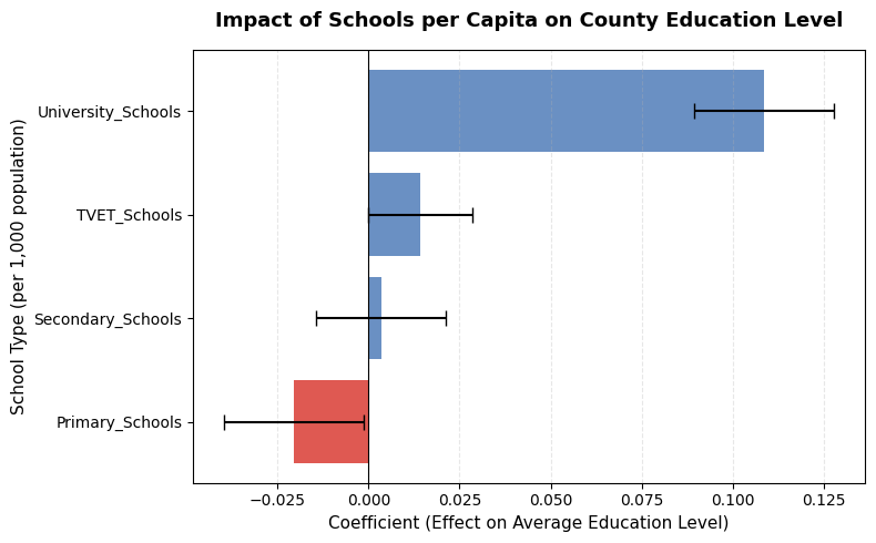
Results show universities have the strongest positive effect (coefficient: 0.11), while TVET (0.016) and Secondary (0.002) have modest impacts. Primary schools appear negative (-0.021), likely due to multicollinearity, as less educated counties have proportionally more primary schools. The model (R² = 0.68) suggests that school distribution, especially university access, relates to county education outcomes. This doesn't mean residents of counties without universities avoid higher education. Rather, they study elsewhere and often don't return.
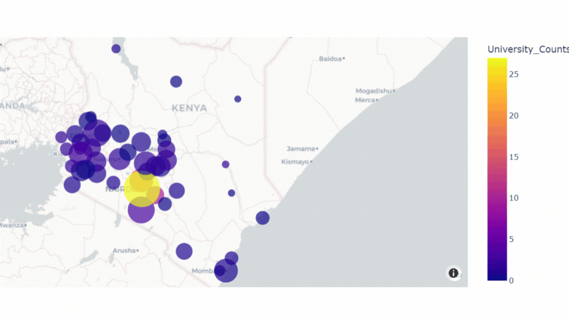
Visualising University Impact
To illustrate how universities concentrate educational attainment, I created an interactive map of Kenya. The bubble size represents the proportion of university-educated residents, while colour intensity shows the number of universities in the county.
The Secondary School Pipeline
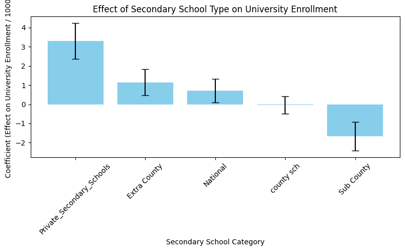
I also examined how secondary school quality affects university enrolment. In Kenya, schools range from elite National and Extra County schools to local County and Sub-County schools, plus Private schools with varying standards. The analysis reveals that Private high schools have the strongest impact on university enrollment (coefficient: 3.3), followed by Extra County high schools (1.2) and National high schools (0.7). County and Sub-County schools show minimal effects, confirming that access to higher-quality secondary education significantly shapes pathways to university.
Why This Matters
The data tells a clear story: Kenya's educational inequality is deeply geographic. Without deliberate investment in higher education infrastructure in underserved counties like Nyandarua, the education gap will continue to widen, perpetuating regional inequality for generations.