
Abstract
In this review and refresher notebook we mix some review work with some of the concepts we’d like you to develop and understand as you progress through the course. The review work focuses on the use of probability, correlation, pandas and the jupyter notebook. Most of the code you need is provided in the notebook, there are a few exercises to help develop your understanding.
Introduction
Welcome to the review and refresh practical. This work is for you to remind yourself about the ways of using the notebook. You will have a chance to ask us questions about the content on 9th of November. Within the material you will find exercises. If you are confident with probability you can likely ignore the reading and exercises which are listed from Rogers and Girolami (2011) and Bishop (2006). There should be no need to purchase these books for this course. The suggestions of sections are there just as a reminder.
We suggest you run these labs in Google colab, there’s a
link to doing that on the main lab page at the top. We also suggest that
the first thing you do is click
View->Expand sections to make all parts of
the lab visibile.
This session should prepare you for different parts of the course practicals and final assignment.
We will use the fynesse library through the course. You will create your own library and will update it as the course progress. The library will also contain your work for the final assignment.
We suggest you complete at least Exercises 4-9.
Setup
notutils
This small package is a helper package for various notebook utilities used below.
The software can be installed using
%pip install notutilsfrom the command prompt where you can access your python installation.
The code is also available on GitHub: https://github.com/lawrennd/notutils
Once notutils is installed, it can be imported in the
usual manner.
import notutilspods
In Sheffield we created a suite of software tools for ‘Open Data Science’. Open data science is an approach to sharing code, models and data that should make it easier for companies, health professionals and scientists to gain access to data science techniques.
You can also check this blog post on Open Data Science.
The software can be installed using
%pip install podsfrom the command prompt where you can access your python installation.
The code is also available on GitHub: https://github.com/lawrennd/ods
Once pods is installed, it can be imported in the usual
manner.
import podsmlai
The mlai software is a suite of helper functions for
teaching and demonstrating machine learning algorithms. It was first
used in the Machine Learning and Adaptive Intelligence course in
Sheffield in 2013.
The software can be installed using
%pip install mlaifrom the command prompt where you can access your python installation.
The code is also available on GitHub: https://github.com/lawrennd/mlai
Once mlai is installed, it can be imported in the usual
manner.
import mlai
from mlai import plot
Nigeria NMIS Data
As an example data set we will use Nigerian Millennium Development Goals Information System Health Facility (The Office of the Senior Special Assistant to the President on the Millennium Development Goals (OSSAP-MDGs) and Columbia University, 2014). It can be found here https://energydata.info/dataset/nigeria-nmis-education-facility-data-2014.
Taking from the information on the site,
The Nigeria MDG (Millennium Development Goals) Information System – NMIS health facility data is collected by the Office of the Senior Special Assistant to the President on the Millennium Development Goals (OSSAP-MDGs) in partner with the Sustainable Engineering Lab at Columbia University. A rigorous, geo-referenced baseline facility inventory across Nigeria is created spanning from 2009 to 2011 with an additional survey effort to increase coverage in 2014, to build Nigeria’s first nation-wide inventory of health facility. The database includes 34,139 health facilities info in Nigeria.
The goal of this database is to make the data collected available to planners, government officials, and the public, to be used to make strategic decisions for planning relevant interventions.
For data inquiry, please contact Ms. Funlola Osinupebi, Performance Monitoring & Communications, Advisory Power Team, Office of the Vice President at funlola.osinupebi@aptovp.org
To learn more, please visit http://csd.columbia.edu/2014/03/10/the-nigeria-mdg-information-system-nmis-takes-open-data-further/
Suggested citation: Nigeria NMIS facility database (2014), the Office of the Senior Special Assistant to the President on the Millennium Development Goals (OSSAP-MDGs) & Columbia University
For ease of use we’ve packaged this data set in the pods
library
data = pods.datasets.nigeria_nmis()['Y']
data.head()
Alternatively, you can access the data directly with the following commands.
import urllib.request
urllib.request.urlretrieve('https://energydata.info/dataset/f85d1796-e7f2-4630-be84-79420174e3bd/resource/6e640a13-cab4-457b-b9e6-0336051bac27/download/healthmopupandbaselinenmisfacility.csv', 'healthmopupandbaselinenmisfacility.csv')

import pandas as pd
data = pd.read_csv('healthmopupandbaselinenmisfacility.csv')
Once it is loaded in the data can be summarized using the
describe method in pandas.
data.describe()We can also find out the dimensions of the dataset using the
shape property.
data.shapeDataframes have different functions that you can use to explore and
understand your data. In python and the Jupyter notebook it is possible
to see a list of all possible functions and attributes by typing the
name of the object followed by .<Tab> for example in
the above case if we type data.<Tab> it show the
columns available (these are attributes in pandas dataframes) such as
num_nurses_fulltime, and also functions, such as
.describe().
For functions we can also see the documentation about the function by following the name with a question mark. This will open a box with documentation at the bottom which can be closed with the x button.
data.describe?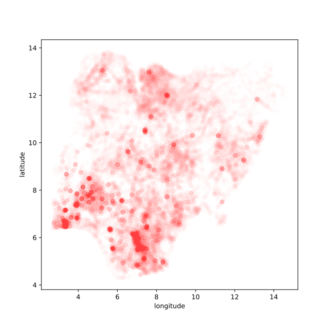

Figure: Location of the over thirty-four thousand health facilities registered in the NMIS data across Nigeria. Each facility plotted according to its latitude and longitude.
Exploring the NMIS Data
The NMIS facility data is stored in an object known as a ‘data
frame’. Data frames come from the statistical family of programming
languages based on S, the most widely used of which is R.
The data frame gives us a convenient object for manipulating data. The
describe method summarizes which columns there are in the data frame and
gives us counts, means, standard deviations and percentiles for the
values in those columns. To access a column directly we can write
print(data['num_doctors_fulltime'])
#print(data['num_nurses_fulltime'])
This shows the number of doctors per facility, number of nurses and number of community health workers (CHEWS). We can plot the number of doctors against the number of nurses as follows.
import matplotlib.pyplot as plt # this imports the plotting library in python_ = plt.plot(data['num_doctors_fulltime'], data['num_nurses_fulltime'], 'rx')You may be curious what the arguments we give to
plt.plot are for, now is the perfect time to look at the
documentation
plt.plot?We immediately note that some facilities have a lot of nurses, which prevent’s us seeing the detail of the main number of facilities. First lets identify the facilities with the most nurses.
data[data['num_nurses_fulltime']>100]Here we are using the command
data['num_nurses_fulltime']>100 to index the facilities
in the pandas data frame which have over 100 nurses. To sort them in
order we can also use the sort command. The result of this
command on its own is a data Series of True
and False values. However, when it is passed to the
data data frame it returns a new data frame which contains
only those values for which the data series is True. We can
also sort the result. To sort the result by the values in the
num_nurses_fulltime column in descending order we
use the following command.
data[data['num_nurses_fulltime']>100].sort_values(by='num_nurses_fulltime', ascending=False)We now see that the ‘University of Calabar Teaching Hospital’ is a large outlier with 513 nurses. We can try and determine how much of an outlier by histograming the data.
Plotting the Data
data['num_nurses_fulltime'].hist(bins=20) # histogram the data with 20 bins.
plt.title('Histogram of Number of Nurses')
We can’t see very much here. Two things are happening. There are so many facilities with zero or one nurse that we don’t see the histogram for hospitals with many nurses. We can try more bins and using a log scale on the \(y\)-axis.
data['num_nurses_fulltime'].hist(bins=100) # histogram the data with 20 bins.
plt.title('Histogram of Number of Nurses')
ax = plt.gca()
ax.set_yscale('log')
Let’s try and see how the number of nurses relates to the number of doctors.
fig, ax = plt.subplots(figsize=(10, 7))
ax.plot(data['num_doctors_fulltime'], data['num_nurses_fulltime'], 'rx')
ax.set_xscale('log') # use a logarithmic x scale
ax.set_yscale('log') # use a logarithmic Y scale
# give the plot some titles and labels
plt.title('Number of Nurses against Number of Doctors')
plt.ylabel('number of nurses')
plt.xlabel('number of doctors')
Note a few things. We are interacting with our data. In particular, we are replotting the data according to what we have learned so far. We are using the progamming language as a scripting language to give the computer one command or another, and then the next command we enter is dependent on the result of the previous. This is a very different paradigm to classical software engineering. In classical software engineering we normally write many lines of code (entire object classes or functions) before compiling the code and running it. Our approach is more similar to the approach we take whilst debugging. Historically, researchers interacted with data using a console. A command line window which allowed command entry. The notebook format we are using is slightly different. Each of the code entry boxes acts like a separate console window. We can move up and down the notebook and run each part in a different order. The state of the program is always as we left it after running the previous part.
Probabilities
We are now going to do some simple review of probabilities and use this review to explore some aspects of our data.
A probability distribution expresses uncertainty about the outcome of an event. We often encode this uncertainty in a variable. So if we are considering the outcome of an event, \(Y\), to be a coin toss, then we might consider \(Y=1\) to be heads and \(Y=0\) to be tails. We represent the probability of a given outcome with the notation: \[ P(Y=1) = 0.5 \] The first rule of probability is that the probability must normalize. The sum of the probability of all events must equal 1. So if the probability of heads (\(Y=1\)) is 0.5, then the probability of tails (the only other possible outcome) is given by \[ P(Y=0) = 1-P(Y=1) = 0.5 \]
Probabilities are often defined as the limit of the ratio between the number of positive outcomes (e.g. heads) given the number of trials. If the number of positive outcomes for event \(y\) is denoted by \(n\) and the number of trials is denoted by \(N\) then this gives the ratio \[ P(Y=y) = \lim_{N\rightarrow \infty}\frac{n_y}{N}. \] In practice we never get to observe an event infinite times, so rather than considering this we often use the following estimate \[ P(Y=y) \approx \frac{n_y}{N}. \]
Probability and the NMIS Data
Let’s use the sum rule to compute the estimate the probability that a facility has more than two nurses.
large = (data.num_nurses_fulltime>2).sum()  # number of positive outcomes (in sum True counts as 1, False counts as 0)
total_facilities = data.num_nurses_fulltime.count()

prob_large = float(large)/float(total_facilities)
print("Probability of number of nurses being greather than 2 is:", prob_large)
Conditioning
When predicting whether a coin turns up head or tails, we might think that this event is independent of the year or time of day. If we include an observation such as time, then in a probability this is known as condtioning. We use this notation, \(P(Y=y|X=x)\), to condition the outcome on a second variable (in this case the number of doctors). Or, often, for a shorthand we use \(P(y|x)\) to represent this distribution (the \(Y=\) and \(X=\) being implicit). If two variables are independent then we find that \[ P(y|x) = p(y). \] However, we might believe that the number of nurses is dependent on the number of doctors. For this we can try estimating \(P(Y>2 | X>1)\) and compare the result, for example to \(P(Y>2|X\leq 1)\) using our empirical estimate of the probability.
large = ((data.num_nurses_fulltime>2) & (data.num_doctors_fulltime>1)).sum()
total_large_doctors = (data.num_doctors_fulltime>1).sum()
prob_both_large = large/total_large_doctors
print("Probability of number of nurses being greater than 2 given number of doctors is greater than 1 is:", prob_both_large)
Exercise 1
Write code that prints out the probability of nurses being greater than 2 for different numbers of doctors.
Make sure the plot is included in this notebook file (the
Jupyter magic command %matplotlib inline we ran above will
do that for you, it only needs to be run once per file).
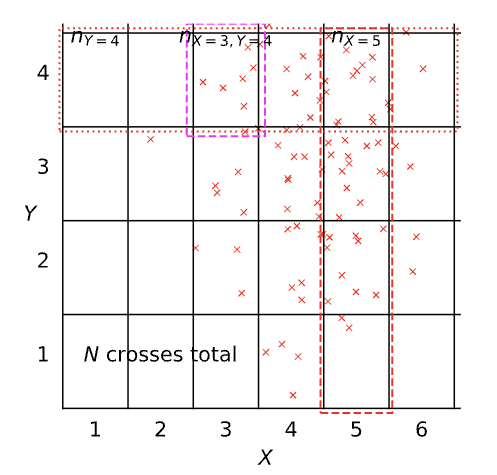
| Terminology | Mathematical notation | Description |
|---|---|---|
| joint | \(P(X=x, Y=y)\) | prob. that X=x and Y=y |
| marginal | \(P(X=x)\) | prob. that X=x regardless of Y |
| conditional | \(P(X=x\vert Y=y)\) | prob. that X=x given that Y=y |
A Pictorial Definition of Probability
Figure: Diagram representing the different probabilities, joint, marginal and conditional. This diagram was inspired by lectures given by Christopher Bishop.
Definition of probability distributions
| Terminology | Definition | Probability Notation |
|---|---|---|
| Joint Probability | \(\lim_{N\rightarrow\infty}\frac{n_{X=3,Y=4}}{N}\) | \(P\left(X=3,Y=4\right)\) |
| Marginal Probability | \(\lim_{N\rightarrow\infty}\frac{n_{X=5}}{N}\) | \(P\left(X=5\right)\) |
| Conditional Probability | \(\lim_{N\rightarrow\infty}\frac{n_{X=3,Y=4}}{n_{Y=4}}\) | \(P\left(X=3\vert Y=4\right)\) |
Notational Details
Typically we should write out \(P\left(X=x,Y=y\right)\), but in practice we often shorten this to \(P\left(x,y\right)\). This looks very much like we might write a multivariate function, e.g. \[ f\left(x,y\right)=\frac{x}{y}, \] but for a multivariate function \[ f\left(x,y\right)\neq f\left(y,x\right). \] However, \[ P\left(x,y\right)=P\left(y,x\right) \] because \[ P\left(X=x,Y=y\right)=P\left(Y=y,X=x\right). \] Sometimes I think of this as akin to the way in Python we can write ‘keyword arguments’ in functions. If we use keyword arguments, the ordering of arguments doesn’t matter.
We’ve now introduced conditioning and independence to the notion of probability and computed some conditional probabilities on a practical example The scatter plot of deaths vs year that we created above can be seen as a joint probability distribution. We represent a joint probability using the notation \(P(Y=y, X=x)\) or \(P(y, x)\) for short. Computing a joint probability is equivalent to answering the simultaneous questions, what’s the probability that the number of nurses was over 2 and the number of doctors was 1? Or any other question that may occur to us. Again we can easily use pandas to ask such questions.
num_doctors = 1
large = (data.num_nurses_fulltime[data.num_doctors_fulltime==num_doctors]>2).sum()
total_facilities = data.num_nurses_fulltime.count() # this is total number of films
prob_large = float(large)/float(total_facilities)
print("Probability of nurses being greater than 2 and number of doctors being", num_doctors, "is:", prob_large)
The Product Rule
This number is the joint probability, \(P(Y, X)\) which is much smaller than the conditional probability. The number can never be bigger than the conditional probabililty because it is computed using the product rule. \[ p(Y=y, X=x) = p(Y=y|X=x)p(X=x) \] and \[p(X=x)\] is a probability distribution, which is equal or less than 1, ensuring the joint distribution is typically smaller than the conditional distribution.
The product rule is a fundamental rule of probability, and you must remember it! It gives the relationship between the two questions: 1) What’s the probability that a facility has over two nurses and one doctor? and 2) What’s the probability that a facility has over two nurses given that it has one doctor?
In our shorter notation we can write the product rule as \[ p(y, x) = p(y|x)p(x) \] We can see the relation working in practice for our data above by computing the different values for \(x=1\).
num_doctors=1
num_nurses=2
p_x = float((data.num_doctors_fulltime==num_doctors).sum())/float(data.num_doctors_fulltime.count())
p_y_given_x = float((data.num_nurses_fulltime[data.num_doctors_fulltime==num_doctors]>num_nurses).sum())/float((data.num_doctors_fulltime==num_doctors).sum())
p_y_and_x = float((data.num_nurses_fulltime[data.num_doctors_fulltime==num_doctors]>num_nurses).sum())/float(data.num_nurses_fulltime.count())

print("P(x) is", p_x)
print("P(y|x) is", p_y_given_x)
print("P(y,x) is", p_y_and_x)
The Sum Rule
The other fundamental rule of probability is the sum rule this tells us how to get a marginal distribution from the joint distribution. Simply put it says that we need to sum across the value we’d like to remove. \[ P(Y=y) = \sum_{x} P(Y=y, X=x) \] Or in our shortened notation \[ P(y) = \sum_{x} P(y, x) \]
Exercise 2
Write code that computes \(P(y)\) by adding \(P(y, x)\) for all values of \(x\).
Bayes’ Rule
Bayes’ rule is a very simple rule, it’s hardly worth the name of a rule at all. It follows directly from the product rule of probability. Because \(P(y, x) = P(y|x)P(x)\) and by symmetry \(P(y,x)=P(x,y)=P(x|y)P(y)\) then by equating these two equations and dividing through by \(P(y)\) we have \[ P(x|y) = \frac{P(y|x)P(x)}{P(y)} \] which is known as Bayes’ rule (or Bayes’s rule, it depends how you choose to pronounce it). It’s not difficult to derive, and its importance is more to do with the semantic operation that it enables. Each of these probability distributions represents the answer to a question we have about the world. Bayes rule (via the product rule) tells us how to invert the probability.
Further Reading
- Probability distributions: page 12–17 (Section 1.2) of Bishop (2006)
Exercises
- Exercise 1.3 of Bishop (2006)
Probabilities for Extracting Information from Data
What use is all this probability in data science? Let’s think about how we might use the probabilities to do some decision making. Let’s look at the information data.
data.columnsExercise 3
Now we see we have several additional features. Let’s assume we want
to predict maternal_health_delivery_services. How would we
go about doing it?
Using what you’ve learnt about joint, conditional and marginal probabilities, as well as the sum and product rule, how would you formulate the question you want to answer in terms of probabilities? Should you be using a joint or a conditional distribution? If it’s conditional, what should the distribution be over, and what should it be conditioned on?
Figure: MLAI Lecture 2 from 2012.
Further Reading
Section 2.2 (pg 41–53) of Rogers and Girolami (2011)
Section 2.4 (pg 55–58) of Rogers and Girolami (2011)
Section 2.5.1 (pg 58–60) of Rogers and Girolami (2011)
Section 2.5.3 (pg 61–62) of Rogers and Girolami (2011)
Probability densities: Section 1.2.1 (Pages 17–19) of Bishop (2006)
Expectations and Covariances: Section 1.2.2 (Pages 19–20) of Bishop (2006)
The Gaussian density: Section 1.2.4 (Pages 24–28) (don’t worry about material on bias) of Bishop (2006)
For material on information theory and KL divergence try Section 1.6 & 1.6.1 (pg 48 onwards) of Bishop (2006)
Exercises
Exercise 1.7 of Bishop (2006)
Exercise 1.8 of Bishop (2006)
Exercise 1.9 of Bishop (2006)
Correlation Coefficients
When considering multivariate data, a very useful notion is the correlation coefficient. It gives us the relationship between two variables. The most widely used correlation coefficient is due to Karl Pearson, it’s defined in the following way.
Let’s define our data set to be kept in a matrix, \(\mathbf{Y}\) with \(p\) columns. We assume that \(\mathbf{ y}_{:, j}\) is the \(j\)th column of that matrix which corresponds to the \(j\)th feature of the data. Then \(y_{i,j}\) is the \(j\)th feature for the \(i\)th data point. Then the sample mean of that feature/column is given by \[ \mu_j = \frac{1}{n} \sum_{i=1}^ny_{i,j} \] where \(n\) is the total number of data points (often refered to as the sample size in statistics). Then the variance of that column is given by,1 \[ \sigma_j^2 = \frac{1}{n} \sum_{i=1}^n(y_{i,j} - \mu_j)^2. \] The covariance between two variables can also be found as \[ c_{j,k} = \frac{1}{n} \sum_{i=1}^n(y_{i,j} - \mu_j)(y_{i, k} - \mu_k). \] If we normalise this covariance by the standard deviaton of the two variables (\(\sigma_j, \sigma_k\)) then we recover Pearson’s correlation, often known as Pearson’s \(\rho\) (the Greek letter rho), \[ \rho_{j,k} = \frac{c_{j,k}}{\sigma_{j} \sigma_{k}}. \] Computing the correlation between two values is a way to determine if the values have a relationship with each other.
One of the problems of statistics, is that when we are working with small data, an apparant correlation might just be a statistical anomally, i.e. a conicidence, that arises just because the quantity of data we have collected is low. In mathematical statistics we make use of hypothesis testing to estimate if a given statistic is “statistically significant”.
In classical hypothesis testing, we define a null hypothesis. This is a hypothesis that contradicts the idea we’re interested in. So for correlation analysis, the null hypothesis would be “there is no correlation between the features \(i\) and \(j\)”. We then measure the \(p\) value. The \(p\) value is the probability that we would observe a value as extreme as the one we see if the null hypothesis is true. If this value is low (typically below 0.05 or below 0.01 depending on how stringent we want to be) we reject the null hypothesis and the statistic is declared to be significant.
Hypothesis testing gives us critical values of the correlation coefficient that we need to believe that there is a relationship between the variables. Those values get smaller as \(n\) gets larger.
Limitations of Pearson’s \(\rho\)
Two major limitations of \(\rho\) that you’ll normally see mentioned. Firstly, the measure is really focussed on linear relationships between variables. It’s possible to construct examples of interesting non-linear relationships between two variables for which the correlation is zero. Secondly, we are often interested in a causal relationship between two variables. Two variables which are not directly related will appear correlated if there is a common factor affecting both variables. For example, we might see a correlation between sales figures for swim gear and ice creams. There is no direct relationship between these to variables, but there is a third variable associated with the passing of the seasons that triggers the sales figures of both swim gear and ice creams to increase.
Let’s look an example using the Nigerian NMIS data.
hospital_data = dataWe’ll just look at the numbers of nurses, doctors, midwives and community health extension workers (CHEWs).
hospital_workers_data = hospital_data[["num_chews_fulltime", "num_nurses_fulltime", "num_nursemidwives_fulltime", "num_doctors_fulltime"]]We can compute the correlation of the columns using
.corr() on the pandas.DataFrame.
import numpy as np
import pandas as pd
Figure: Correlation matrix for the number of community health workers, nurses, midwives and doctors in the Nigerian NMIS health centre data.
From plotting this matrix of correlations, we can immediately see that there are good correlations between the numbers of doctors, nurses and midwives, but less correlation with the number of community health workers.
There are also specialised libraries for plotting correlation
matrices, see for example corrplot from
biokit.viz.
Before we proceed, let’s just dive deeper into some of these correlations using scatter plots.
Plotting Variables
When exploring a data set it’s often useful to create a scatter plot
of the different variables. In pandas this can be done
using pandas.tools.plotting.scatter_matrix.
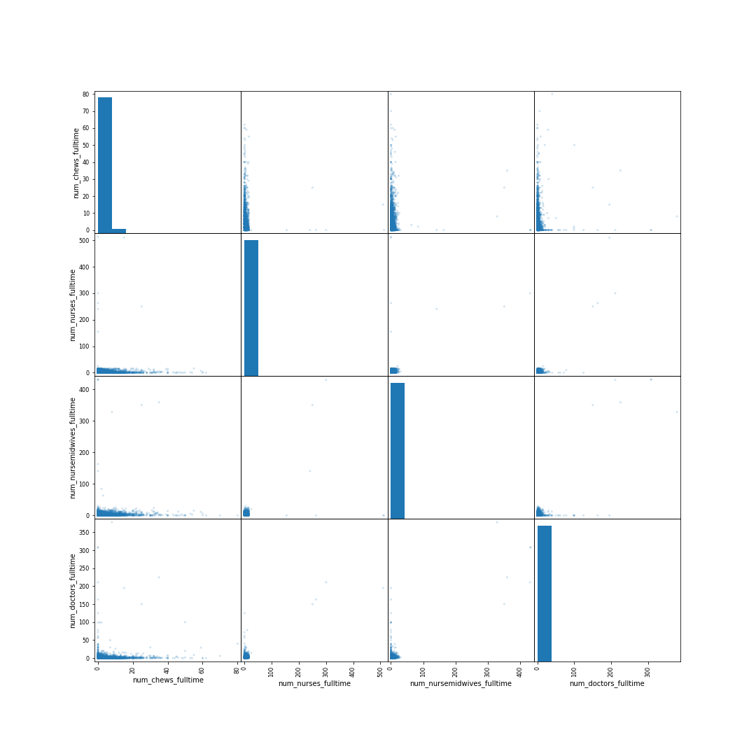
Figure: Scatter matrix of the numbers of commuity health extension workers, nurses, doctors and midwives in the Nigerian health facilities data. Numbers are hard to see because they range from small numbers to larger numbers.
Immediately we note that the values are difficult to see in the scatter plot. They are ranging from zero for some health facilities but to hundreds for others. To get a better view, we can look at the logarithm of the data. Some counts are zero, so instead of plotting the logarithm directly, we plot \(\log_{10}(\cdot + 1)\) as follows.
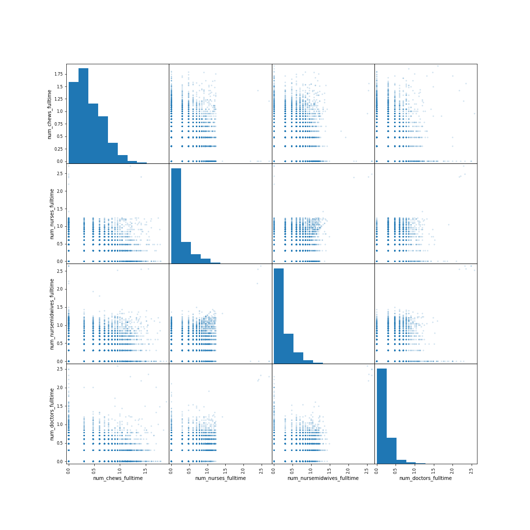
Figure: Scatter matrix of the \(\log_{10}(\cdot + 1)\) of numbers of commuity health extension workers, nurses, doctors and midwives in the Nigerian health facilities data.
There are a few odd things in the plots that might be worth investigating. For example, the nurse numbers seem to drop very abruptly after some point. Let’s investigate by zooming in on a region of the relevant plot.
Figure: Zoom in on the scatter plot of the number of nurses in the health centres. There’s an odd “cliff” in the data density between 1.2 and 1.3.
From the zoom in we can see that the cliff is occurring somewhere below 1.3 on the plot, let’s find what the value of this cliff is.
hospital_data["num_nurses_fulltime"][np.log10(hospital_data["num_nurses_fulltime"]+1)<1.3].max()Giving us the value of 16. This is slightly odd, and suggests the values may have been censored in some way. We can see this if we bar chart them.
Figure: Number of nurses in each health centre. Note the over-representation of centres with 10 nurses, as well as the underrepresentation of centres with over 16 nurses.
Not only do we see the cliff after 16 nurses, but there are a few other interesting effects. The number of health centres with 10 nurses is many more than those with either 9 or 11 nurses. This is likely an example of a rounding effect. When people report numbers by hand, they tend to round them. This may well explain the overepresentation of 10. This should give some cause for concern about the data.
Aside: likely the problems in the NMIS data are to do with mistakes in reporting, but analysis of data can also be used to unpick serious problems in scientific data. See for example this paper Evidence of Fraud in an Influential Field Experiment About Dishonesty (Simonsohn et al., 2021), which ironically finds evidence of fraud in a paper about dishonesty. One of the techniques they use is looking for overrepresentation of round numbers in hand-reported data. Another technique that can be used when looking for fraudulent data is known as Benford’s law, which describes the distribution of first digits.
Structuring Your Code using the Fynesse Template
Figure: The Fynesse Template gives you a starting point for building your data science library. You can fork the template, and then create a new repository from the template. You can use that repository for your analysis.
Along this notebook, you have created different pieces of code to manage your data. You first executed some commands to download and explore your data. Then, you used pieces of code to plot and assess the datasets. In the end, you explored some statistical concepts to analyse your data.
The problems a data scientist faces and the strategies for their resolution are usually quite similar between domains and datasets. For example, you might want to download different datasets but the API request follows always the same logic. It makes sense then to structure your code in a way it can be reused and you save time. That is one of the technical goals we want you to achieve in this course. To facilitate this, you should use the Fynesse template for structuring your code.
The Fynesse template provides a Python template repo for doing data analysis according to the Fynesse framework (Access, Assess, and Address). You will use this template to create your own data analysis library. If you define such a library in a general enough way, you should be able to use the code you write in this course in your future data science projects.
We expect you to keep this library updated and use it during the course practicals and final assessment. In fact, for the final assignment, you will provide a short repository overview describing how you have implemented the different parts of the project and where you have placed those parts in your library. We will use your library to understand and reconstruct the thinking behind your analysis.
Please follow this instructions to create your Python library based on the Fynesse Template:
You should start by forking the Fynesse Template repository.
A fork is a copy of a repository. Forking a repository allows you to freely experiment with changes without affecting the original project.
You can fork the repository using your web explorer and your GitHub
account. In the
Fynesse template GitHub repository click on the Fork
box, and then click on + Create a new fork. You will see
another page to set the details of your library. Name your repository
using your CRSid with the following format:
[CRSid]_ads_2024.
Ensure you copy the main branch only. You can change the description
as you wish and then click on Create fork.
After creating the fork, you should have the template in your own GitHub as a repository with the name you set when creating the fork. Clone this repo in your machine and open it using the IDE of your preference so you can start making changes to your library following the Fynesse template.
Let’s create a Hello World! method in the
access layer.
def hello_world():
  print("Hello from the data science library!")
Copy the code above to the access.py file in your
library. The file is in the path ./fynesse/access.py.
Commit and push your changes. Now, you are ready to import and use your library from this notebook.
%pip uninstall --yes fynesse
# Replace this with the location of your fynesse implementation
%pip install git+https://github.com/githubusername/fynesse_template.git
import fynessefynesse.access.hello_world()Thanks!
For more information on these subjects and more you might want to check the following resources.
- book: The Atomic Human
- twitter: @lawrennd
- podcast: The Talking Machines
- newspaper: Guardian Profile Page
- blog: http://inverseprobability.com